Aurora, Illinois
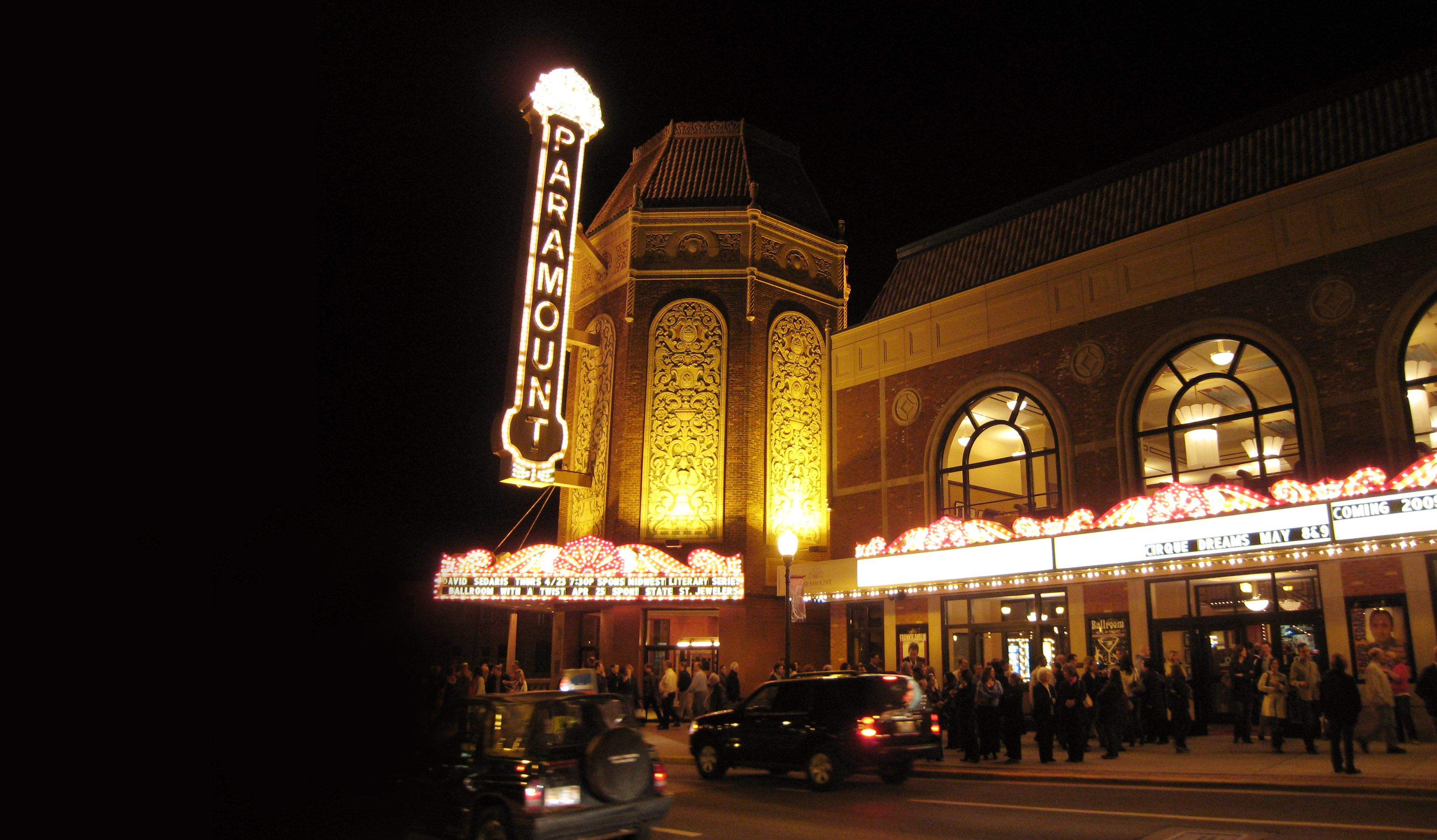
For those who believe variety is the spice of life, Aurora, the second largest city in Illinois, is where the light from many lamps ignites a cultural, commercial and communal awakening providing a brighter and more colorful future for all.
Category
Community WideAbout This Project
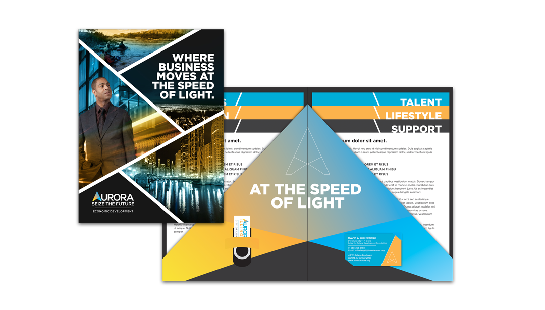
In recent decades, Aurora has transformed from a blue-collar town into a high-performing, high-tech progressive city boasting the second largest population in Illinois. But the majority of marketing materials for city initiatives didn’t reflect this forward movement. City leaders were interested in a new brand that included a new logo, strapline and strategic plan for giving Aurora a competitive edge – particularly for economic development.
Aurora has always been a progressive, forward-thinking community. In 1881 it was the first US city to have electric streetlights. As a result, the moniker, “City of Lights” was born. North Star research showed a positive connection to the line today and nearly limitless opportunity for reinvention of what it means for the future (not to mention the significant equity Aurora has built in the line). Reinforcing the value of the strapline were recent efforts by competing cities to use the line for their own purposes. Turns out sometimes what you’re looking for really is right in your own back yard.
Brand Identity
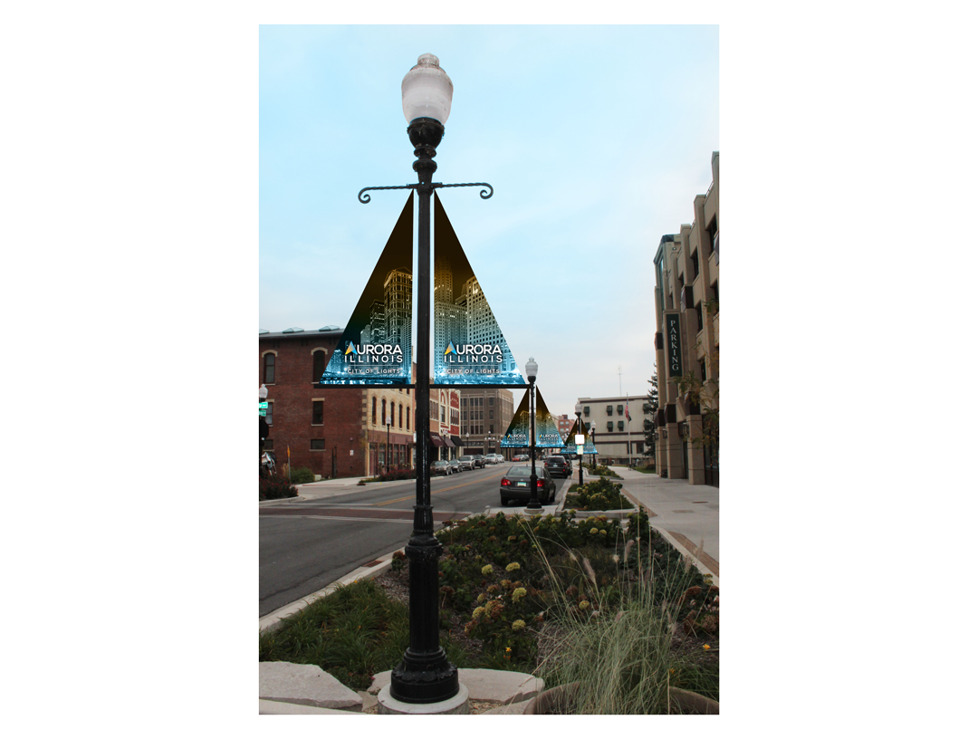
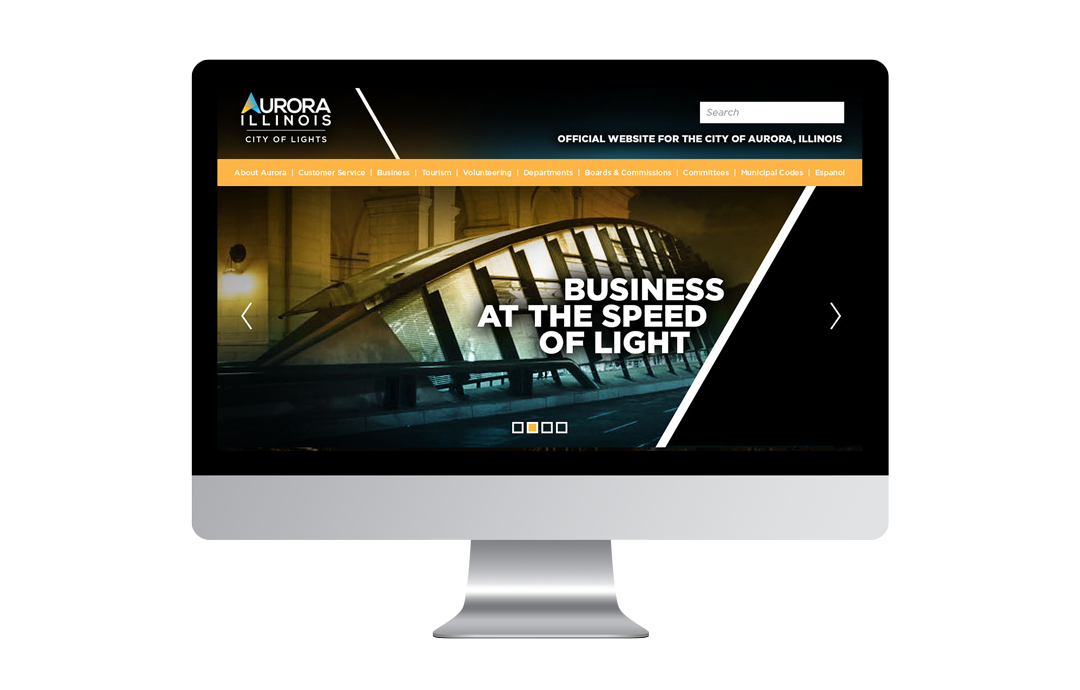
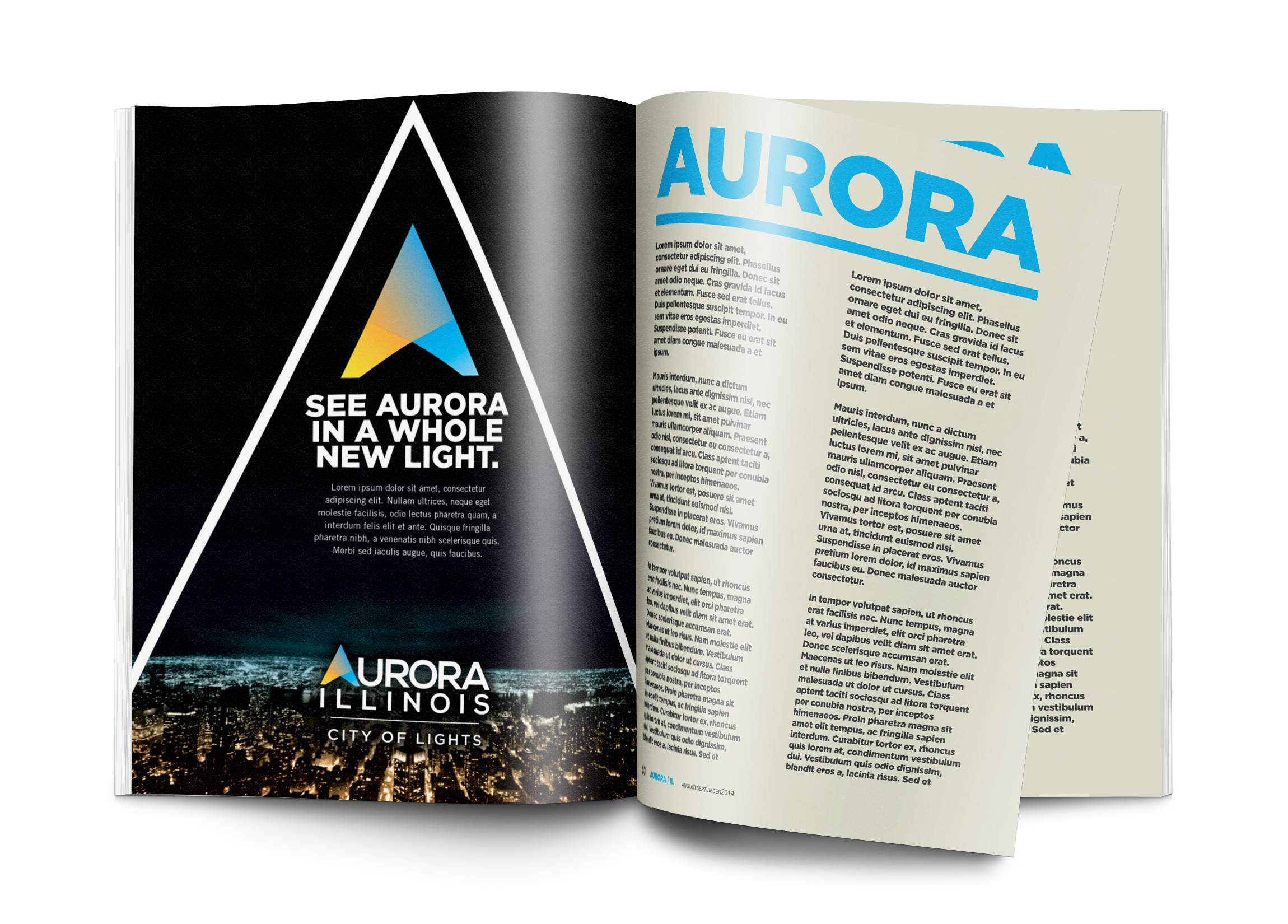
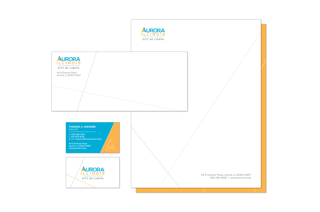
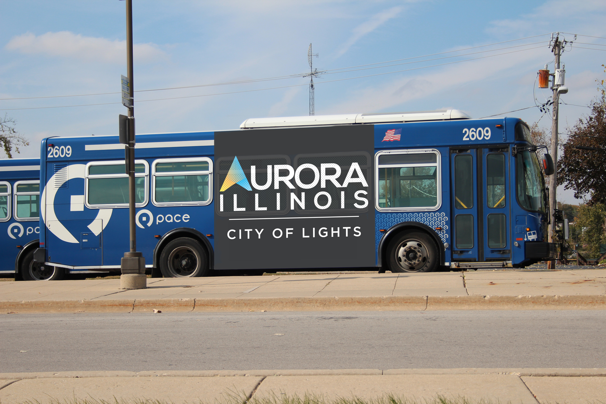
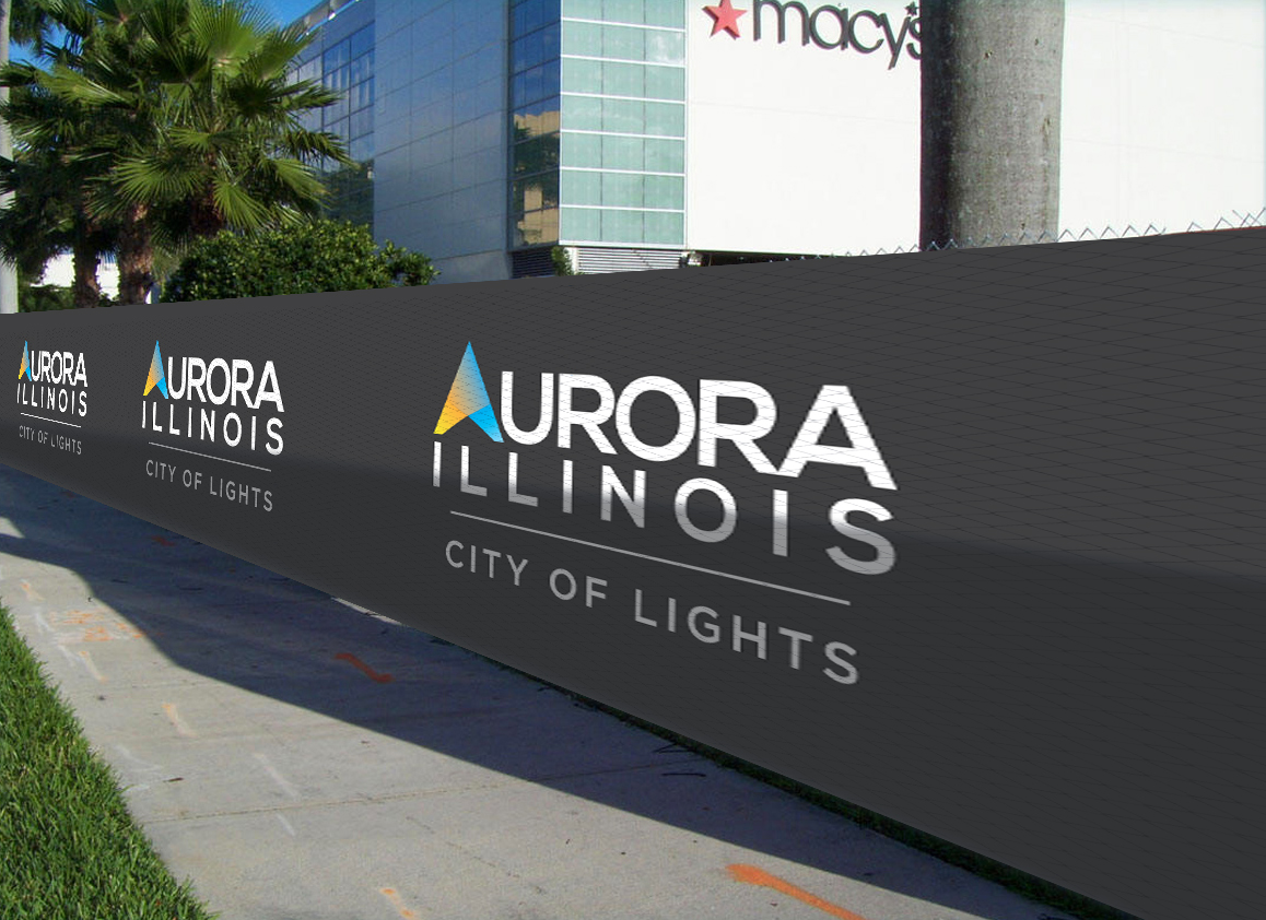
The challenge was to evolve the existing line from its “streetlight” days to an identity that captured the bright, beautiful, diverse, optimistic, hopeful, visionary, guiding, giving and constantly igniting spirit of 21st century Aurora. To tell the deeper story beyond the strapline, creative expressions of the brand needed to convey the power, warmth and speed that light carries with it. This inspired an identity with bright colors and imagery that capture’s the city’s visionary spirit. Anchored by the line City of Lights, the new logo features an iconic “A” created by two interconnected spotlights.
