Woodstock, Illinois
For those who like to get out of metro chaos, Woodstock, at the top of Illinois on the Northwest Metra line into Chicago, welcomes you to its famous Square and eclectic, classic downtown community so you can enjoy good fun and good company again and again.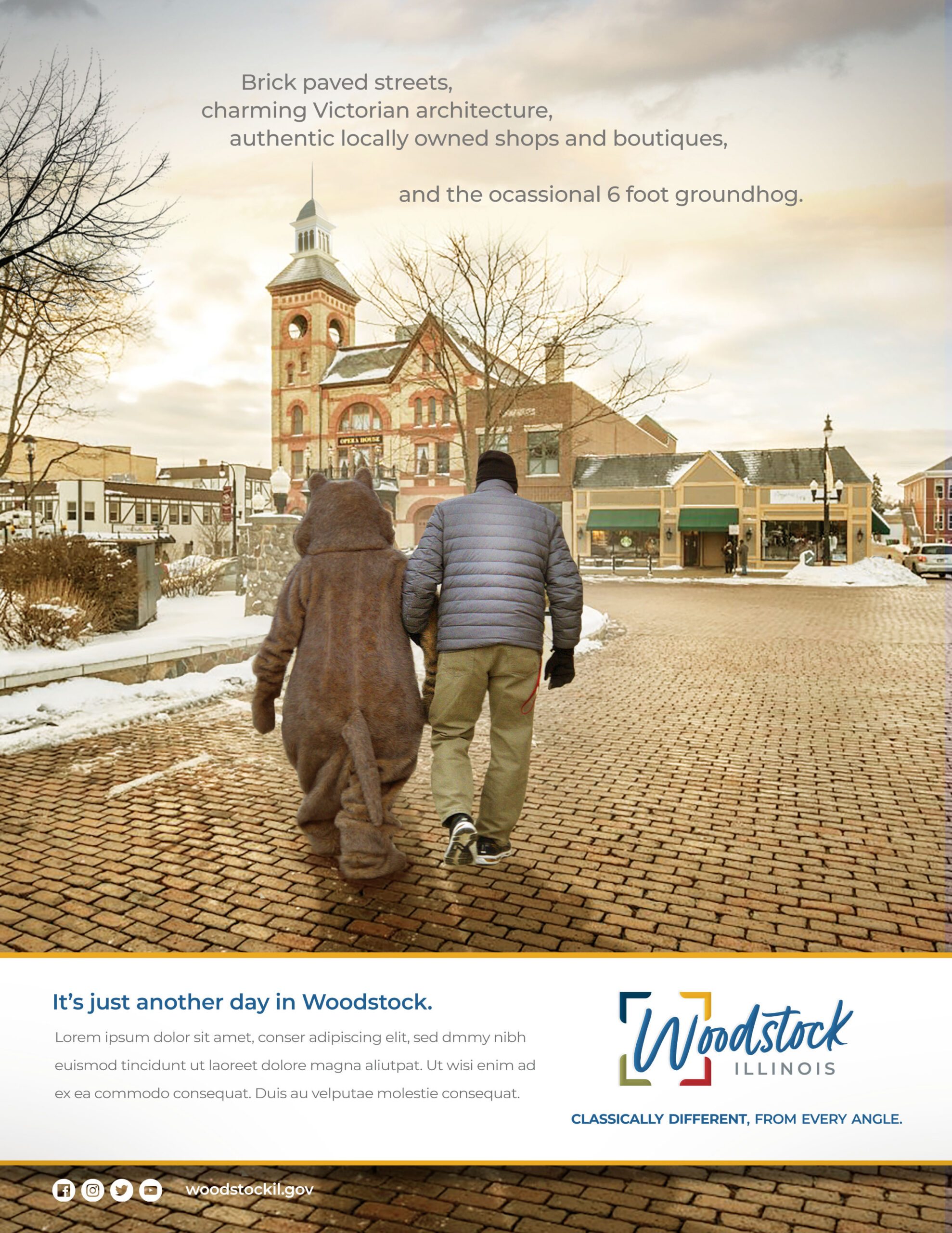
Category
Community WideAbout This Project
As the geographic center and seat of McHenry County, Illinois, Woodstock has long invited people to look northwest of Chicago for a small town alternative to the Windy City. It has made headlines, both with events of regional importance and as the manufacturer of typewriters in the early 20th century. It has graced the small and silver screens, etching itself into the cultural consciousness repeatedly. In 2021, Woodstock even captured the attention of communications giant T-Mobile, winning its “Hometown Techover” contest to once again make the community the face of next-gen progress.
To better orient itself to meet future goals and expectations, the City of Woodstock sought a comprehensive brand marketing campaign that demonstrated cohesiveness across departments and functions. City leaders hoped to use the brand as a tool to drive business attraction and retention, energize current residents, position the municipality as a desirable place for relocation, and enhance regional perception and visitation. The brand makeover represented only the first step in a larger effort to spur growth, build up infrastructure, and rekindle the curiosity of visitors and investors. Because when you’ve been in the spotlight as long as Woodstock has, you recognize that a great first impression gets your foot in the door, but your looks can only get you so far.
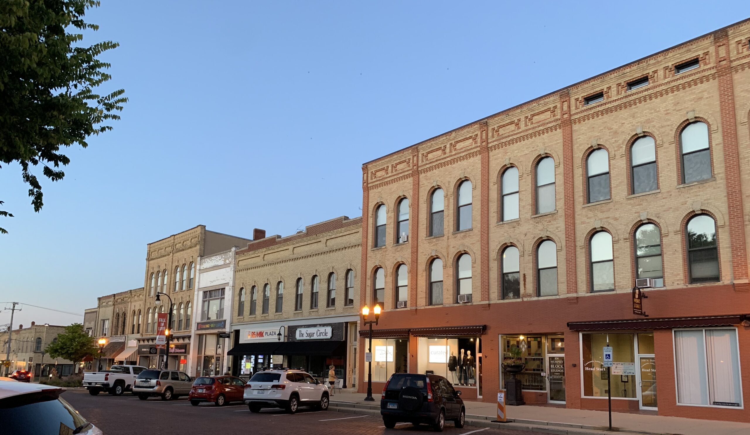
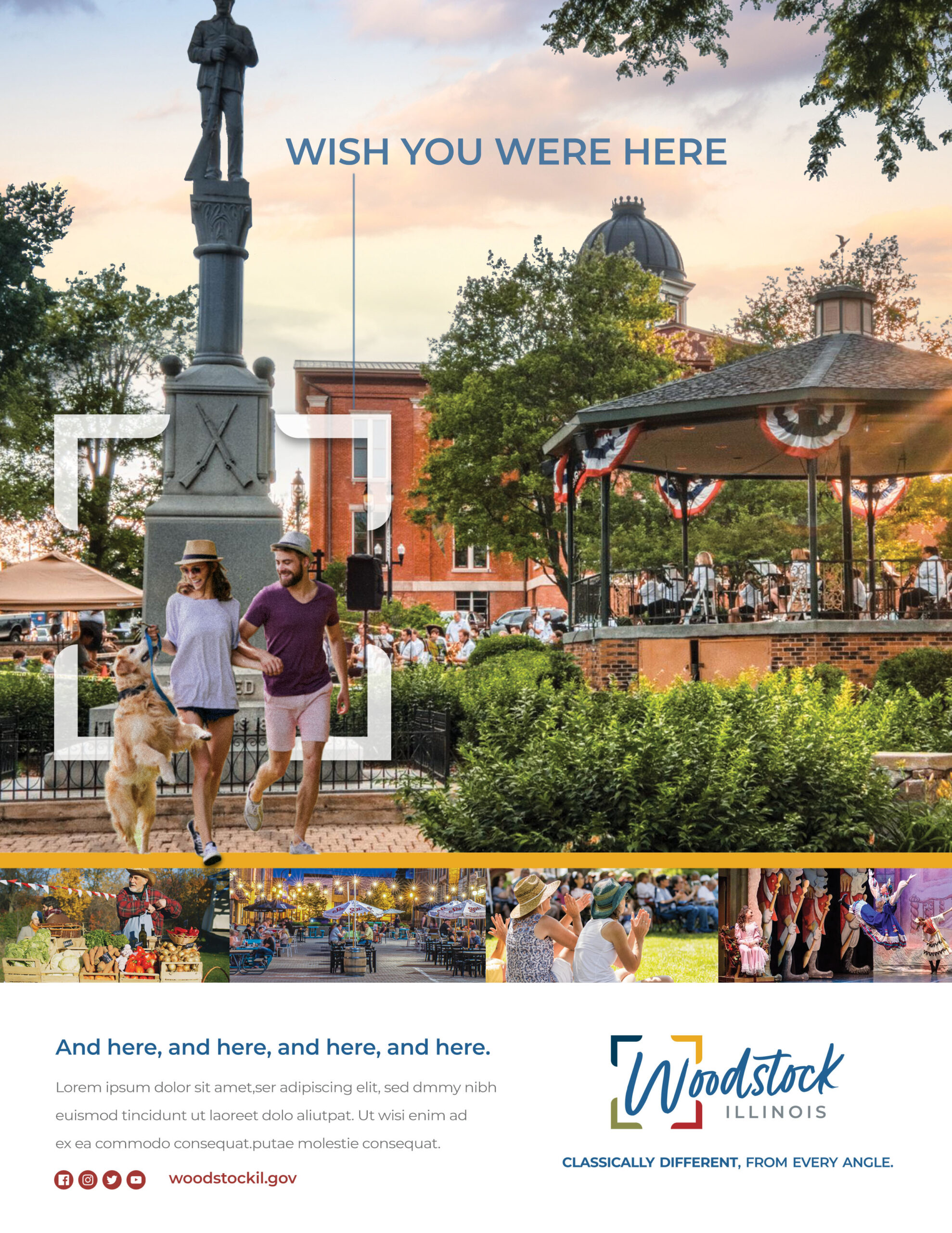
Woodstock is famous for its picturesque Downtown Square featured in TV and film—most notably, Bill Murray’s classic hit, Groundhog Day. Year after year, the community embraces the holiday by celebrating Woodstock Groundhog Days. Woodstock is known for its large-scale events hosted on the Square, at the Opera House, and across the community.
This storybook city has an attractive downtown area with preserved architecture and a scenic tree canopy. Woodstock strives to preserve its classic beauty and small-town atmosphere, which are points of pride for the community. Great parks and schools add to the enviable quality of life. The City’s location in northern Illinois makes it a perfect escape for Chicagoland urbanites and a reward for visitors from rural areas in the west, providing a breath of fresh air and fun for both.
Brand Strategy
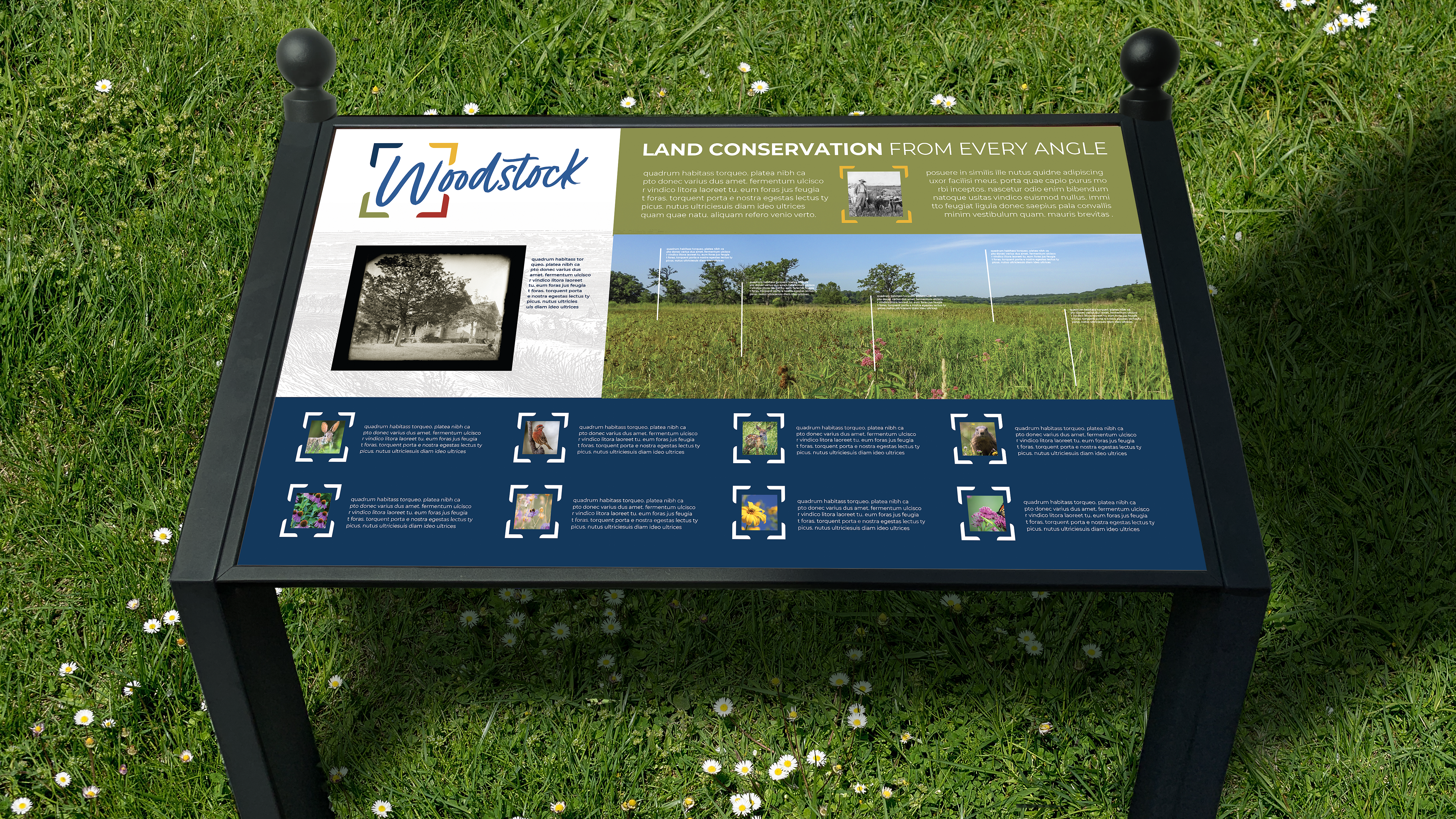
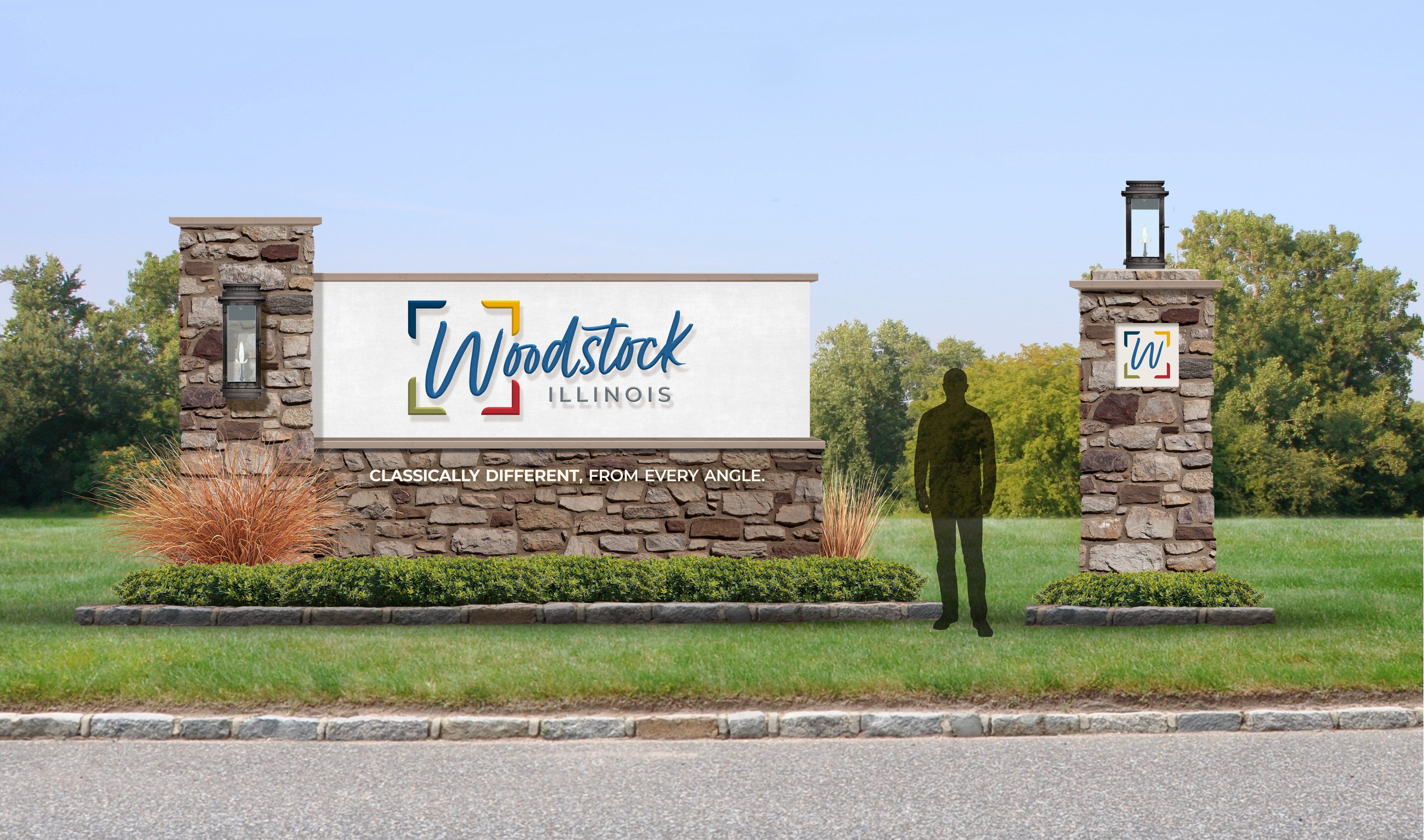
The Woodstock Square is famous and familiar, with a lot of brand equity already existing throughout the region. To modernize the brand while not departing from established perceptions, the Square remains at the heart of the appeal to unify residents and give visitors a unique experience they can’t otherwise find northwest of Chicago. The strapline of “Classically Different, From Every Angle.” contrasts two pillars of Woodstock’s identity—hinting at the readaption of the City’s history. “Every Angle” delivers the idea that this is a multifaceted place with interest and intrigue across the community, while subtly nodding to the four corners of a square.
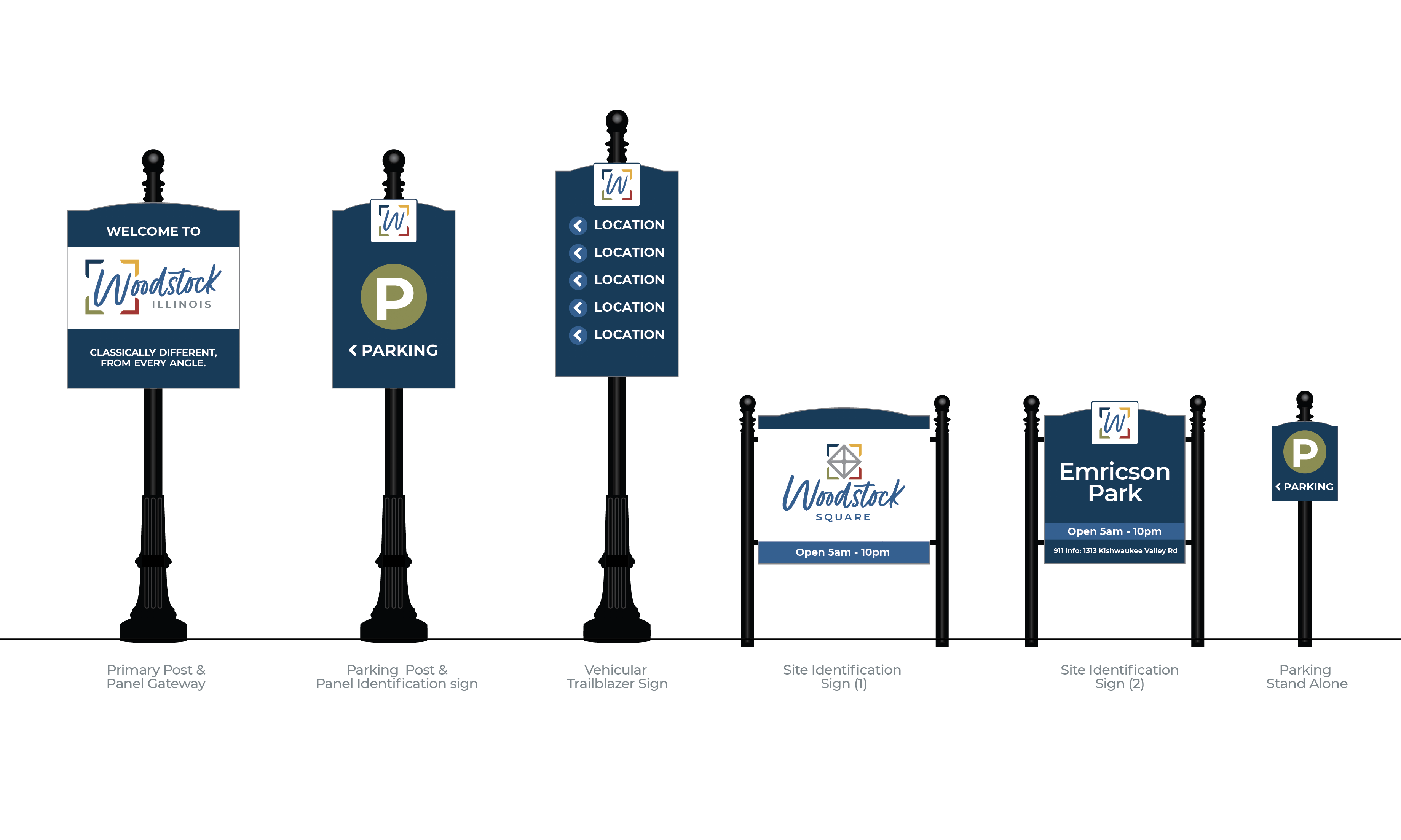
The updated logo delivers a modern and friendly flair while incorporating some of the fabric of the traditional mark. The heart of Woodstock (the Square) is represented in the integrated icon, and its openness indicates that there is much more to discover and enjoy. The custom, handwritten wordmark has a very personal and welcoming feeling. Once the City brand was complete, North Star developed a full slate of companion logos for numerous partners and departments in the City, including the public library, courthouse, Opera House and its adjacent cafe, rec center and department, water works, and the Square. Each of these sub-brands contains elements unique to them that showcase either their offerings or their historic architecture, while all maintaining the parent brand’s colors and typography.