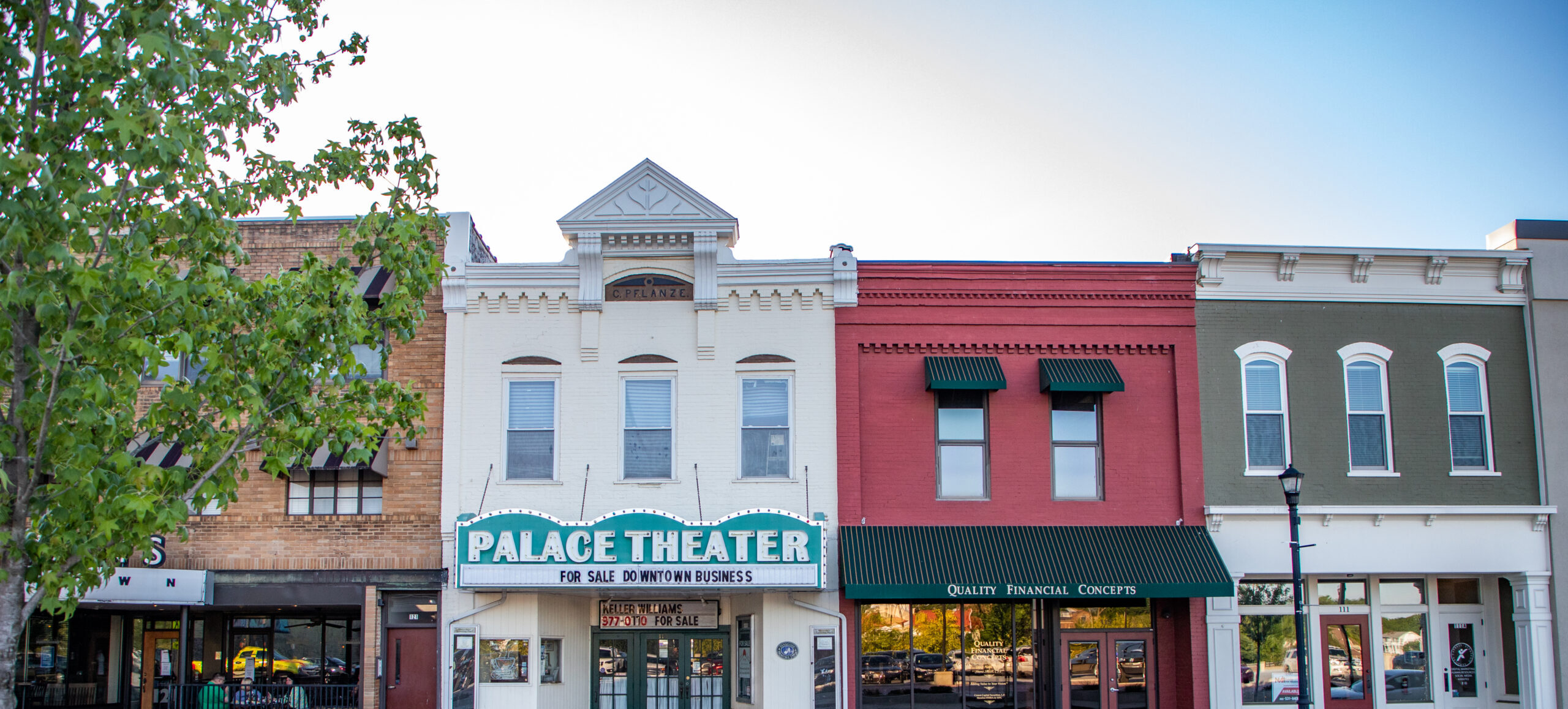
Downtown Maryville, Tennessee
For initiators and collaborators who prefer the agility of something smaller, Maryville's authentic downtown in the scenic foothills of the Smokies, invites independent enterprises and experiences that elevate personal interactions, so what you spend here (family time, money, tuition, time outdoors, investment, etc.) feels meaningful and purposeful.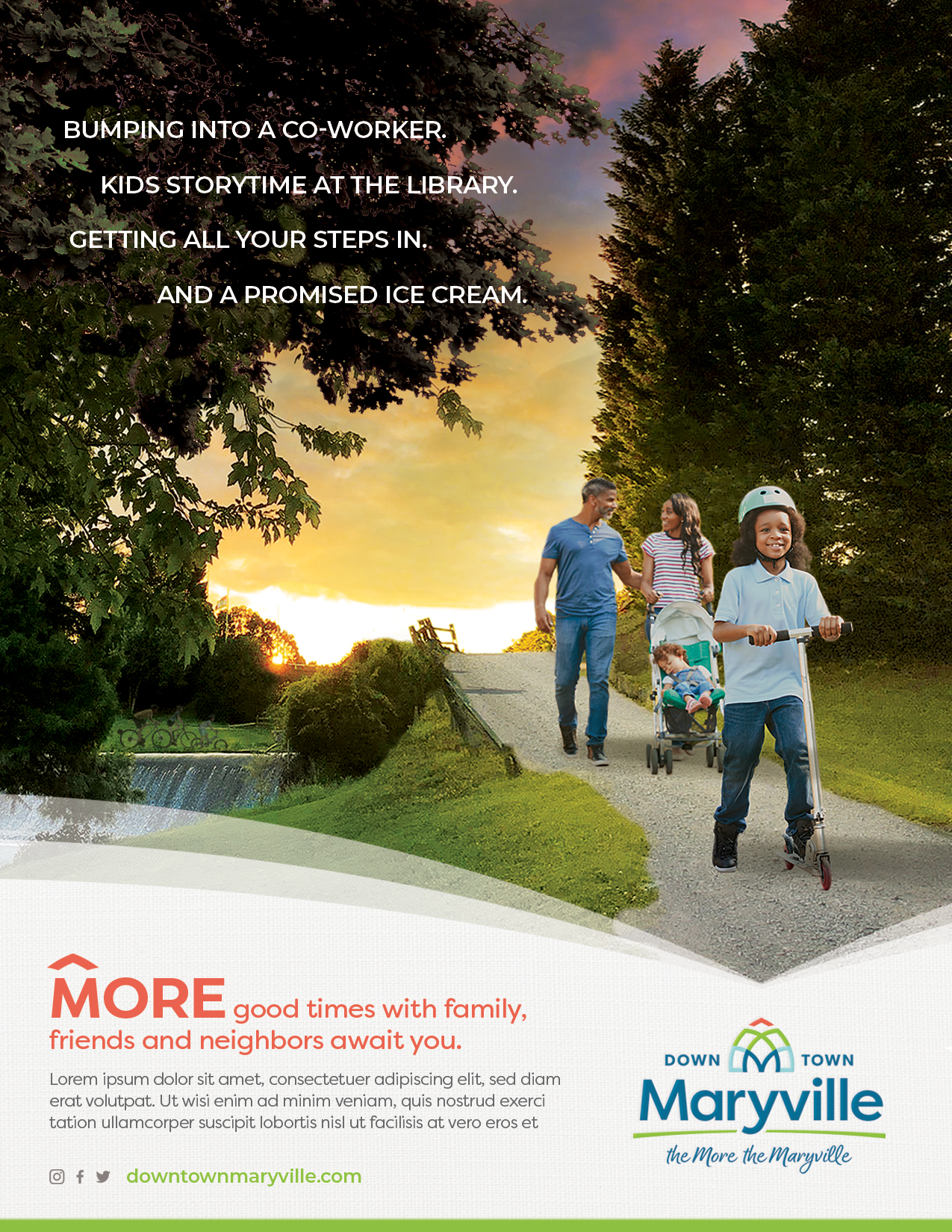
Category
DowntownAbout This Project
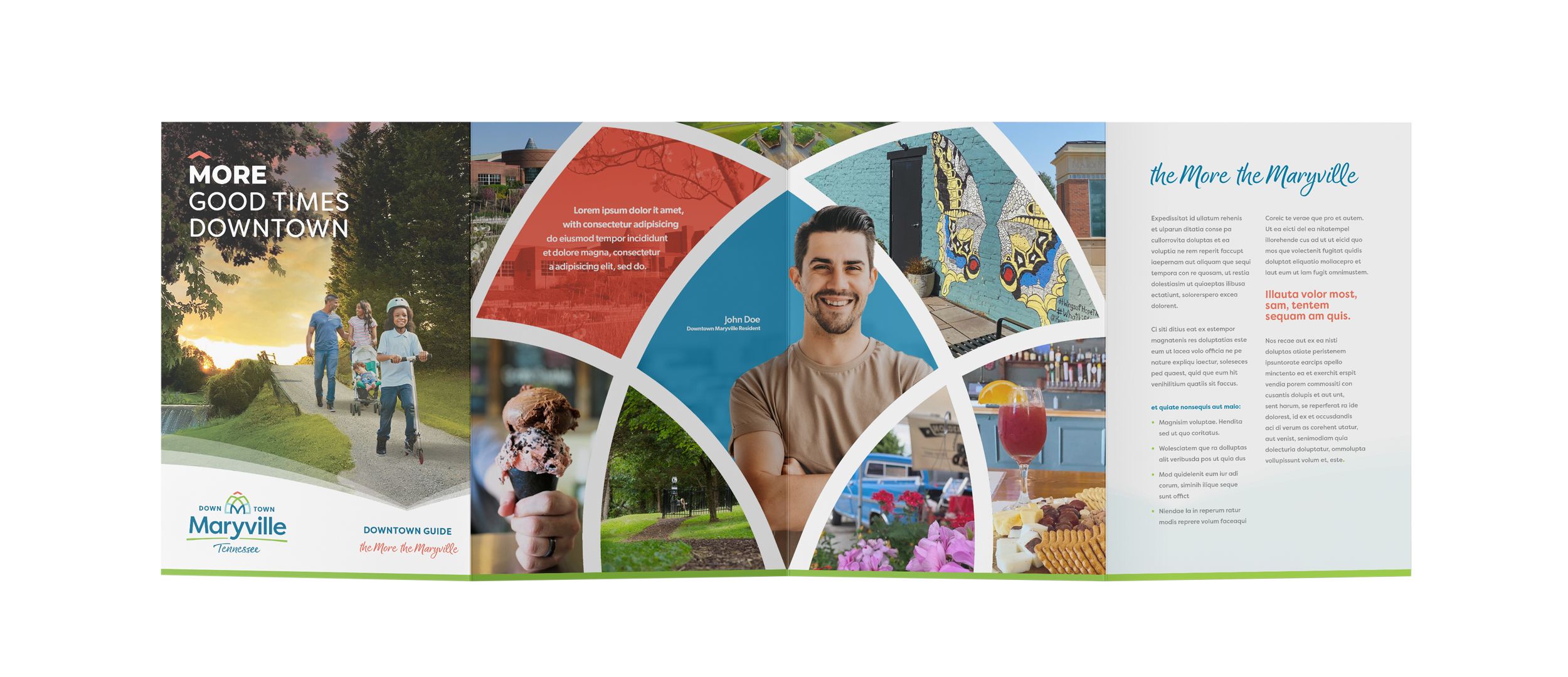
Downtown Maryville is the dynamic center to one of the most lauded towns in Tennessee. At the entrance to the peaceful (not plastic) side of the Smokies, the vibrancy, charm, and potential of this area often goes unnoticed as people pass through to the national park. Even Maryville residents look beyond their own downtown and venture to Downtown Knoxville. The City of Maryville and Downtown businesses needed a way to elevate the regard and pride that people have for Downtown as a place to live, visit, and do business.
Brand Strategy
Don’t you love it when you find somewhere that feels just right? Downtown Maryville is one of those rare places. It is an enviable reward for initiators and collaborators who prefer the agility of something smaller. This authentic downtown makes what you spend here (family time, money, tuition, time outdoors, investment, etc.) feel meaningful and purposeful.
Within the walls of historic storefronts and theaters and the hearts of those who call this place home endures a spirit of community and deep connection to this place and to each other. It celebrates an historic character and a modern disposition that nourishes collaboration and welcomes all good ideas and good times. In Downtown Maryville, it’s always The More the Maryville.
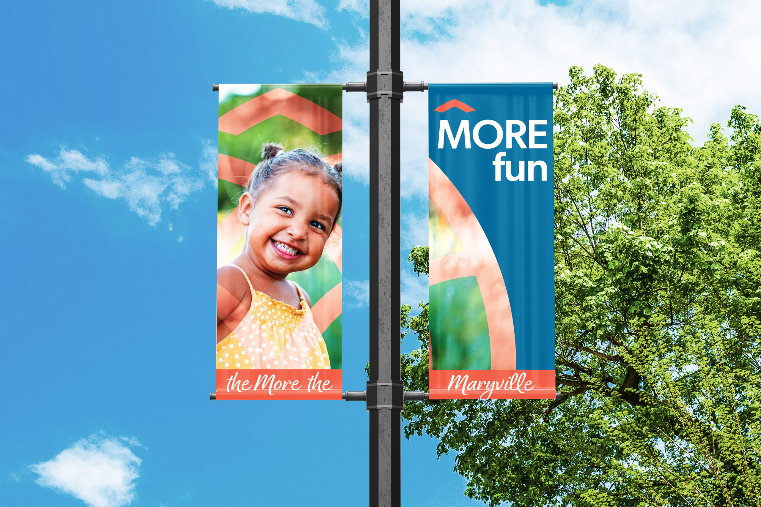
The More the Maryville line phonetically is similar to “the more the merrier” and indicates that all are welcome and, in fact, each person amplifies the experience. The line speaks to the idea that something great is building in Downtown Maryville, and there is room for meaningful connections and growth without being crowded or chaotic. It invites interest that there is more going on in Maryville and its Downtown than expected. Its friendly and invitational tone is fun and memorable.
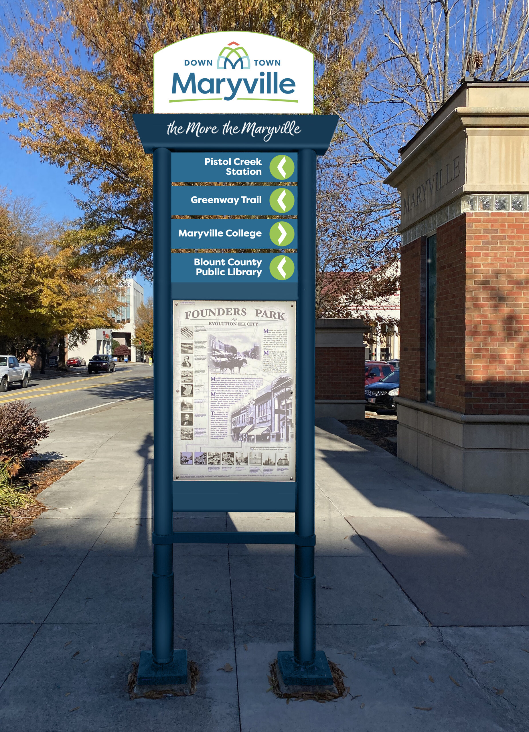
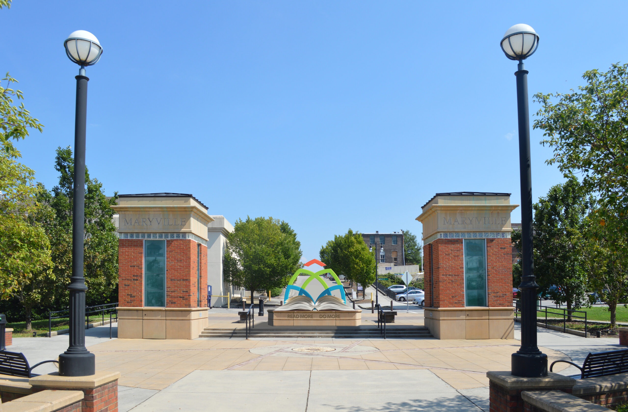
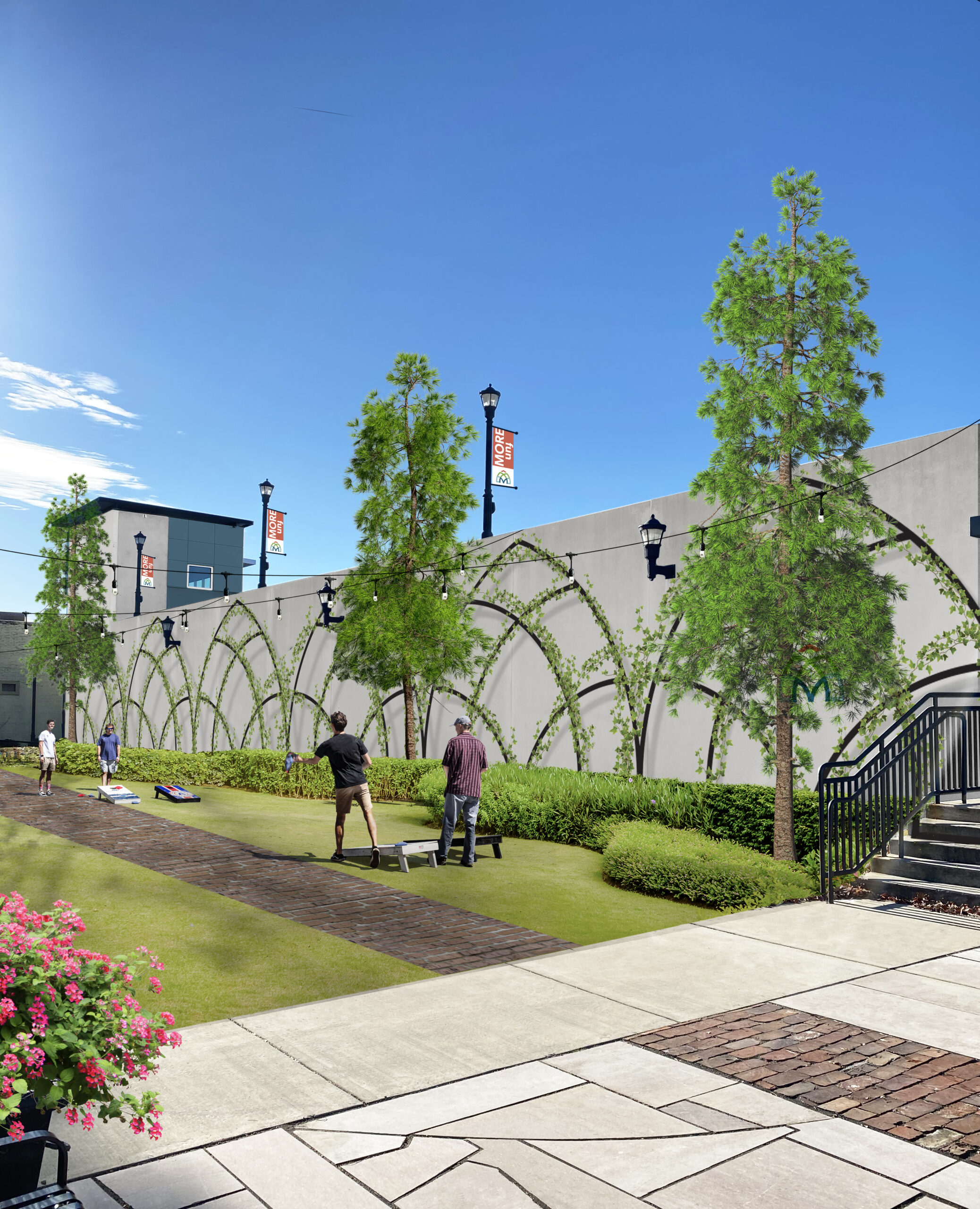
The icon is inspired by the historic architecture of downtown and given a slightly more modern feeling with line connections, mountain elements, and embedded “M.” Clearly legible sans serif fonts are used as the bases for the wordmark and the use of the upper and lower case for “Maryville,” along with some customizations to the letter forms, creates a friendly, welcoming feeling. The tone is accentuated by the slightly curved underline and handwritten strapline treatment.
