Sun Prairie, Wisconsin
For families wanting some room to grow in the Upper Midwest, Sun Prairie, rising to the northeast of Madison, celebrates all things endearing and fun—from Jimmy and Georgia to midget cars and corn—and welcomes everyone to come as you are to enhance our collective future.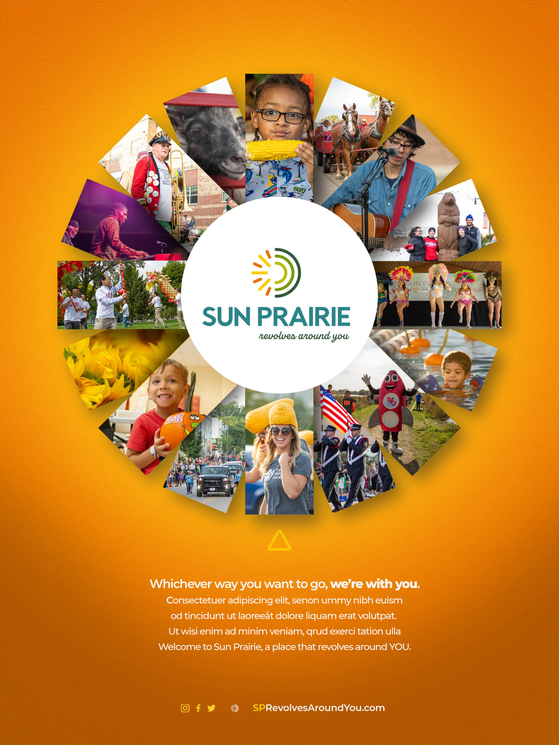

Category
Community WideAbout This Project
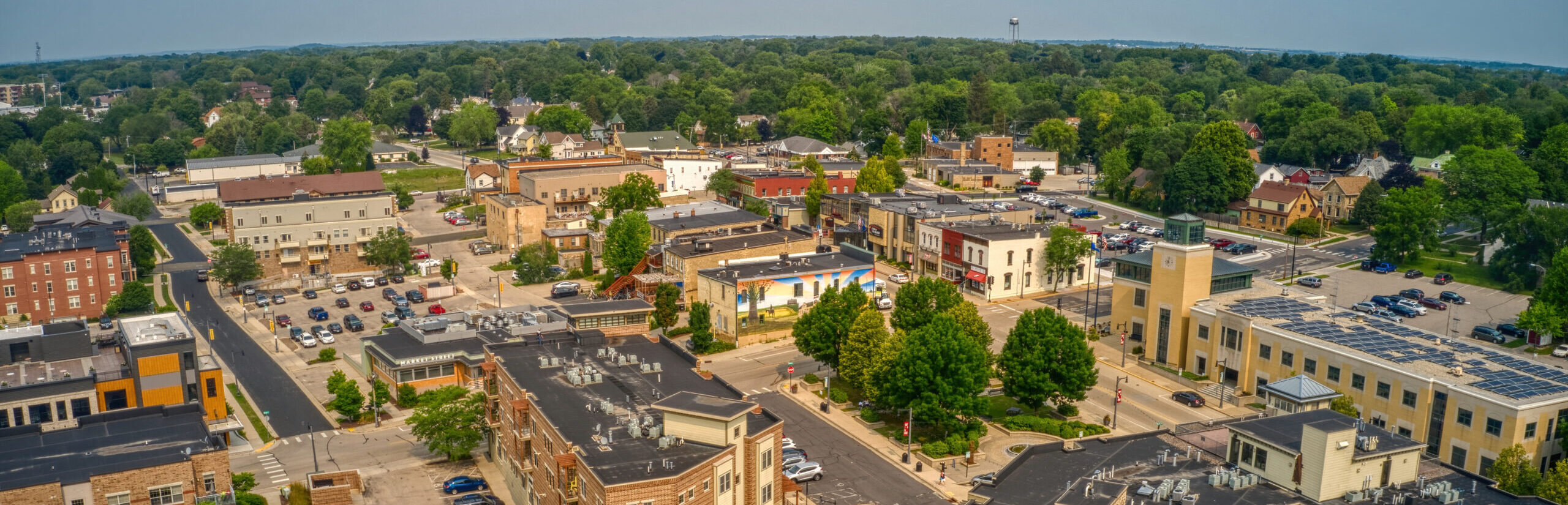
Sun Prairie is the second largest community in Dane County, Wisconsin, but its bright personality and unique appeal are often overshadowed by Madison and lumped into suburban sameness. Sun Prairie needed to step into its sunlights as a place of opportunity and growth without betraying its interesting, small-town vibe.
Rising to the northeast of Madison towards Milwaukee, the city of Sun Prairie offers families, entrepreneurs, and businesses room to grow their families and enterprises in a close-knit community with strong character and a quirky nature. The community continues to celebrate the fun and interesting while presenting the quality of life and opportunity that people seek. From a groundhog to a world famous painter to what everyone expects from a sunny prairie—corn, Sun Prairie is known for events and gatherings that introduce many to its strong sense of community.
Brand Strategy
Sun Prairie needed a brand identity as fresh and open as the community. One that communicates what you get in Sun Prairie are diverse friends, neighbors, mentors, and leaders who welcome you into their orbit and become part of yours. So everyone can feel like the community revolves around them and supports their interests. It doesn’t seem mathematically possible for a community to revolve around every individual. It seems counterintuitive. Unbelievable really. But it’s true. Everyone can enjoy the community on their own axis with a sense of belonging and connection that has become rare these days. Therefore, the brand needed to put everyone at the center.
The brand also needed to remind people that the city is perfect for families—especially those with teenagers. Teenagers think the world revolves around them anyway, so here, they’ll be right. Great schools and teams and bands and arts make great citizens. Sun Prairie makes that a priority.
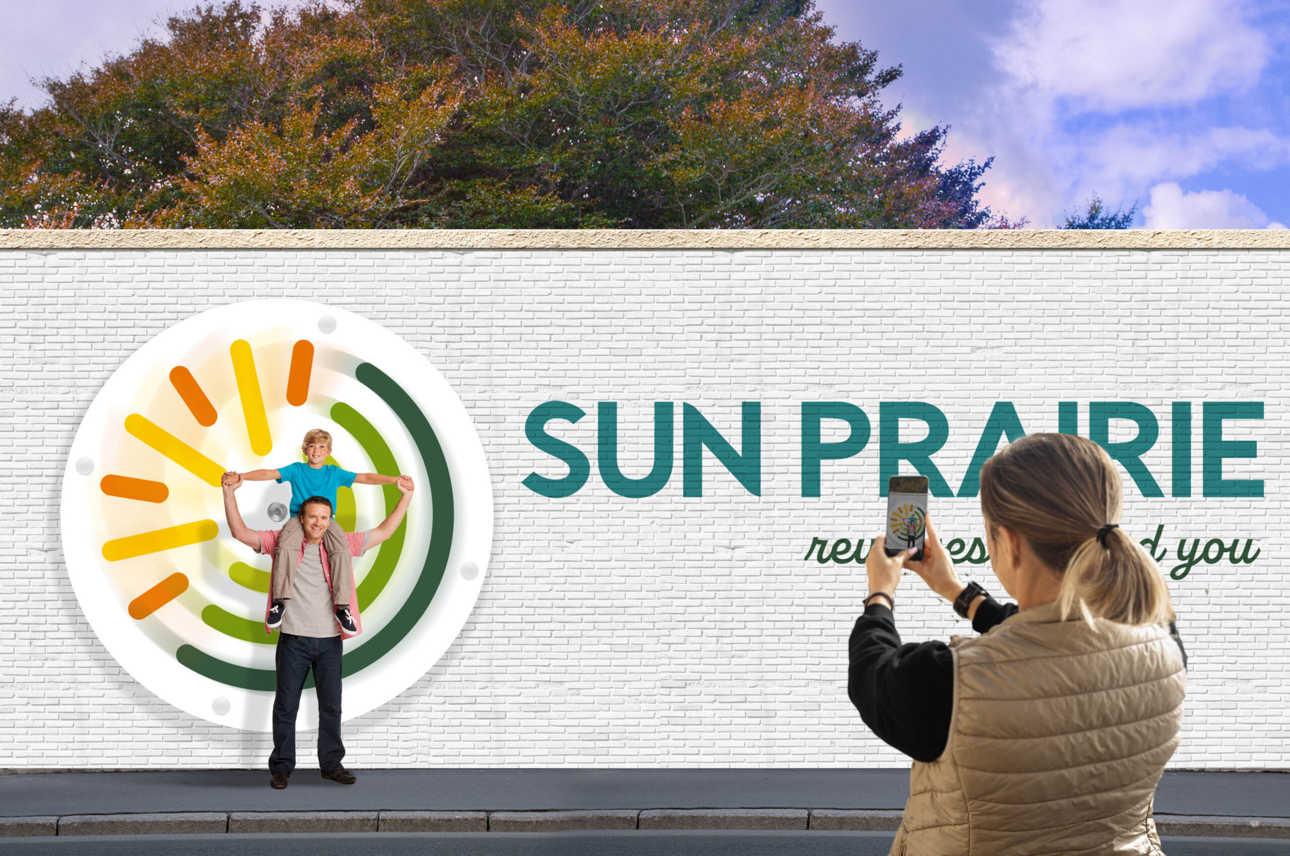
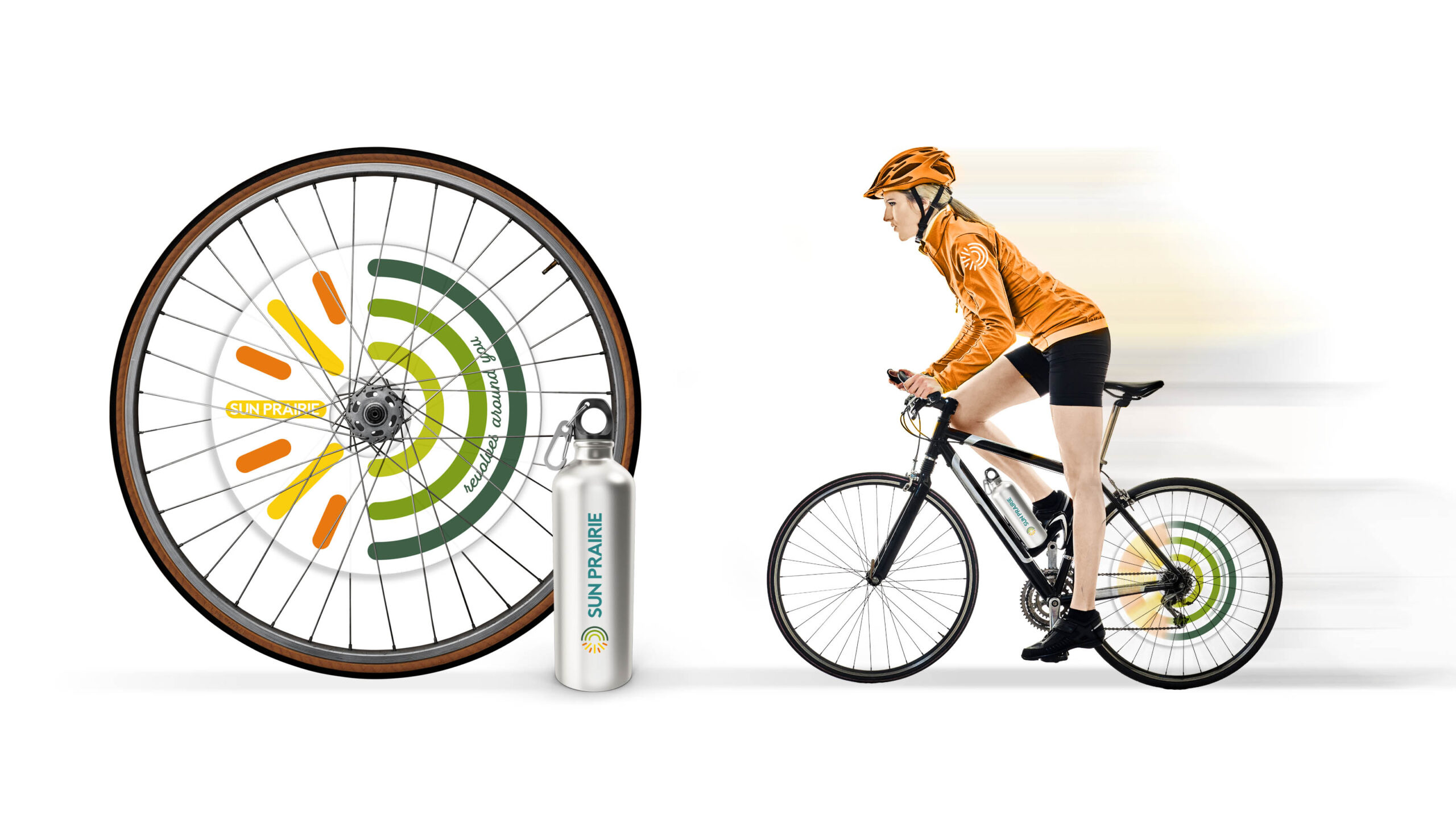
The logo is a stylized depiction of the name and also brings a sense of movement. It reflects the community’s focus on bringing things together (diverse and interesting people, places, and things) to make a whole. The mark is paired with an established but approachable wordmark in all caps and a handwritten style script font for the strapline to give it a personal, invitational flair.
A subtle inversion of the central position of the sun, Revolves Around You, puts the reader at the heart of the Sun Prairie universe, making their growth, enjoyment, and success of utmost importance. It establishes a sense of constant motion where there is always something going on, and it’s all powered by families and individuals in the city. It brings forward the idea that this community adapts to the diverse backgrounds and interests of its people, providing the right opportunity and resources in the right place. It encourages the community to come together and also communicates the commitment that the city has to residents and businesses.