Greene County, Ohio
For those seeking a convenient spot to rally or recharge, Greene County, OH just east of Dayton between Columbus and Cincinnati, provides space to do great things encouraging you to spread your wings.


Category
TourismAbout This Project
Sometimes an expansive wealth of diverse assets can be as difficult to “brand” as a dearth of assets…particularly if the destination’s key consumer markets are equally as varied. Such was the case in Greene County, Ohio. With so much to do, so much space, so many different communities and tremendous diversity in visitors it was difficult to hone in on a focused identity. Even descriptions of Greene County vary widely among stakeholders and visitors.
Regardless of the asset, description or type of visitor, when it comes to Greene County, they all have one thing in common: space. Greene County’s green, rolling hills mean it has space in terms of countryside and acreage. It also has the dimension of air space due to its special connection with aviation both historically with the Wright Brothers, and continuing into the future with Wright Patterson Air Force Base. It has miles of trails and acres of playing fields and parks for youth sports and outdoor recreation. Greene County also offers broad and varied meeting space as well as the room people need to be different, be unique and be free.
In addition, the idea of lots of space — particularly green, recreation-based space — is something that primary competitors Dayton and Columbus (which are often described as “crowded”) can’t come close to offering.
Brand Identity
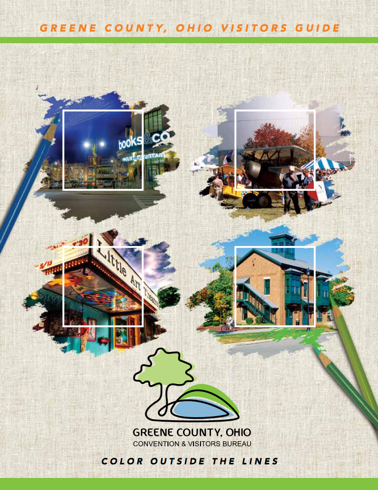
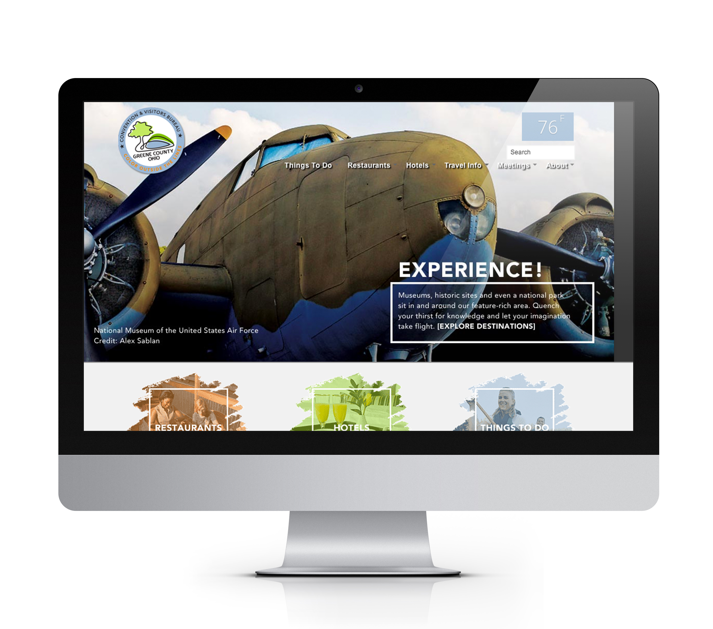
The natural beauty and brilliant colors associated with Greene County combined with the space and freedom to be yourself inspired the compelling line “Color Outside the Lines”. A vivid logo uses a single black line to create a silhouette representative of the County’s natural beauty while vibrant hues casually applied to give the logo a bright, easy, free feel. The design effect of a casual, bright, unconstrained brush stroke gives everything from advertising to digital media impact and appeal.
