
Grand River Valley, Ohio
For enotourists and enthusiasts, the Grand River Valley, in Ohio's picturesque Ashtabula and Lake Counties, gets you closer to the grape and raises a glass to robust, relaxing experiences full of personality so you can savor memorable moments for a lifetime.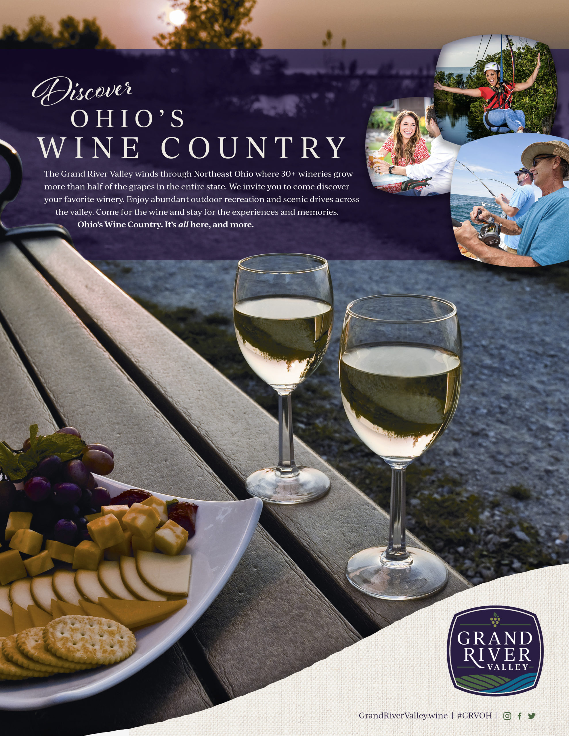

Category
TourismAbout This Project
Ashtabula County and Lake County, just east of Cleveland, Ohio, are home to a growing American Viticultural Area (AVA), which is a designated wine grape-growing region in the United States. Thanks to Ohio quickly becoming a more prominent wine destination, Ashtabula and Lake County’s AVA was earning more and more traction due to their increasingly higher-quality wines and growing winery community.
County leaders believed the region’s name, ‘Ohio’s Wine Country,’ didn’t quite resemble the distinct value that enotourists would experience when visiting. Additionally, while wine is a key part of the counties’ economies, they both have broader missions and objectives. Thus, they needed a name and visual identity that differentiated the area from nearby wine regions, positioned the AVA as a must-visit wine destination and would set them on a path for an even greater national presence.
North Star was engaged to reimagine the area’s name and tagline structure and develop a brand that would help them reach their goals.. The process included a competitive audit, brand development and the formation of a creative identity that would establish a unique positioning for the area.
The Ashtabula County and Lake County AVA is home to beautiful hills, water and other elements of nature that all of the great wine regions across the U.S. offer. With popular wine destinations typically being known as specific regions, instead of broad and discreet locations, it was clear that the ‘Ohio’s Wine Country’ name and visual identity needed to evolve to better reflect its strengths and resonate with wine travelers.
Brand Identity
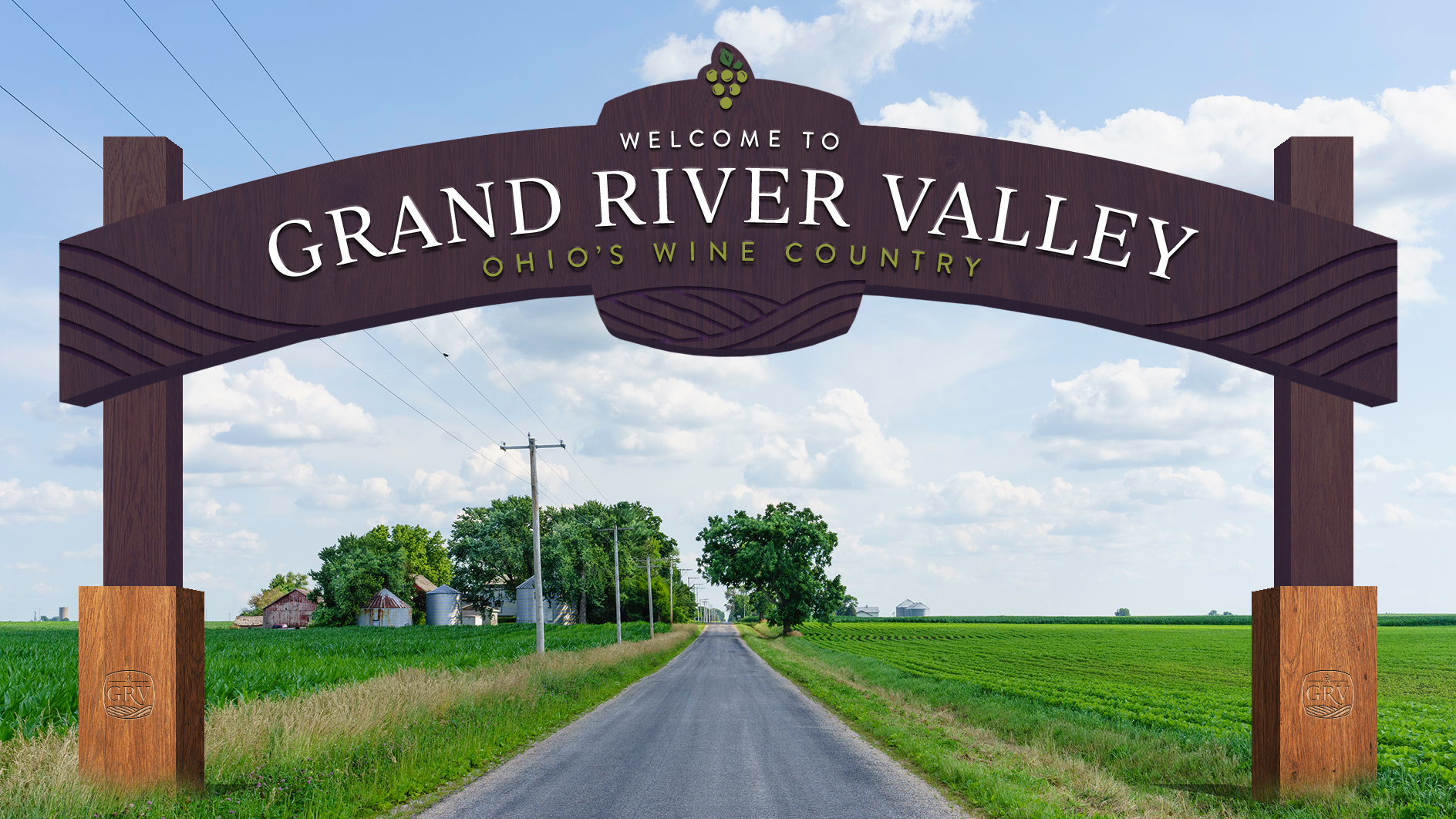
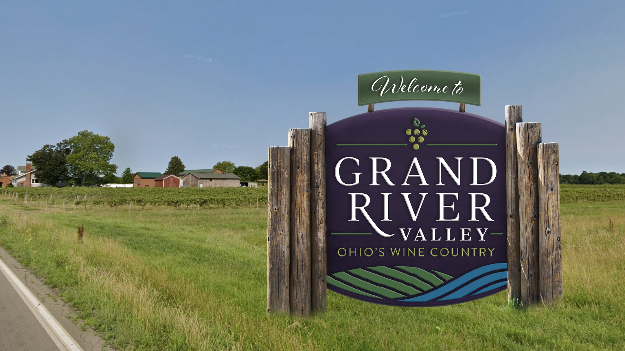
Inspired by the Grand River that flows through the region and the area’s breathtaking nature, the name ‘Grand River Valley’ was born. With enotourists being very familiar with Valley-based location names, which are associated with many popular/quality wine regions worldwide, the name has a more emotive sense of place that wine travelers expect. To not lose existing brand equity and awareness, ‘Ohio’s Wine Country’ was ultimately repositioned as a supportive tagline for the area.
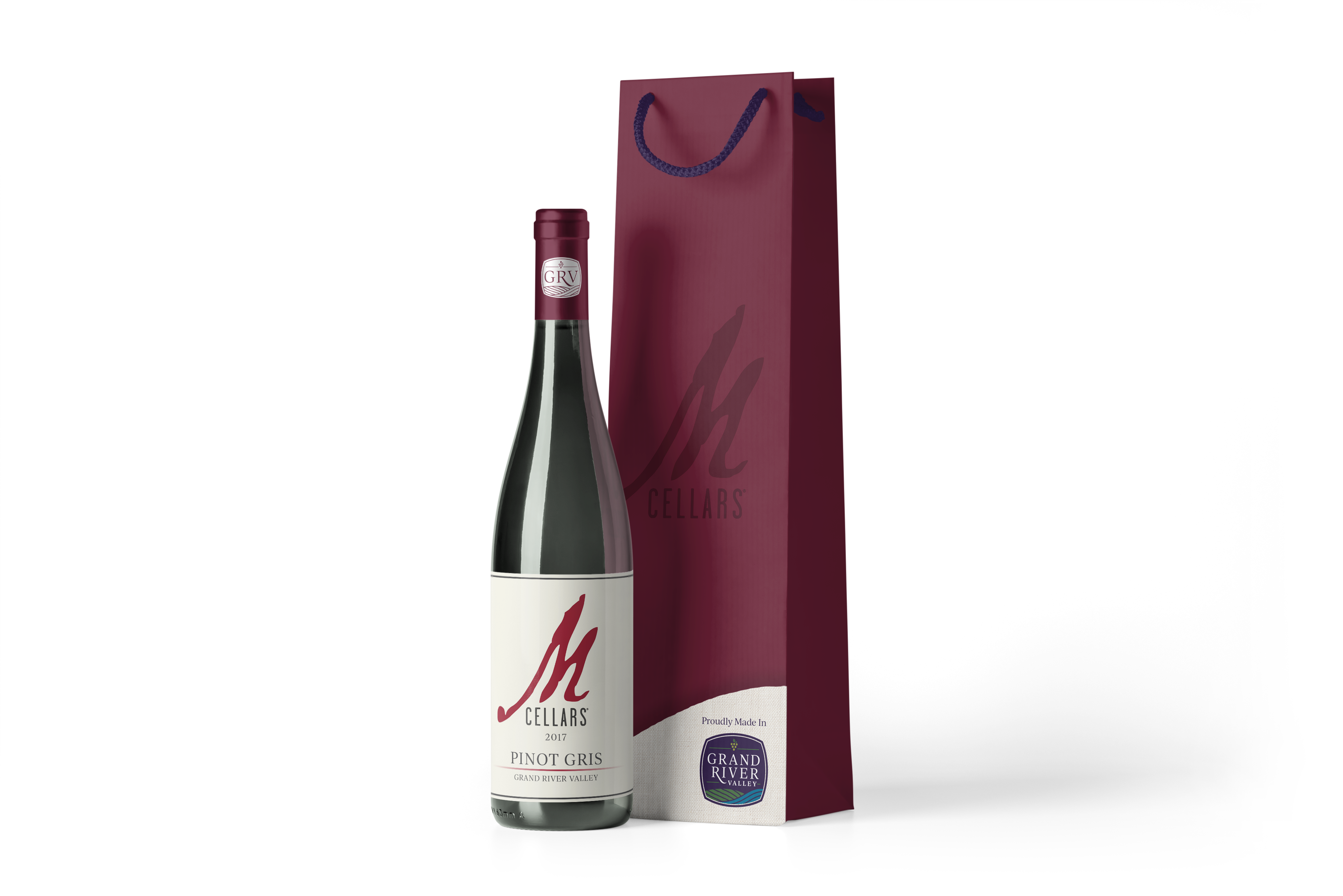
The logo is contained in a distinctive shape that is mildly reminiscent of a barrel. Inside with the destination name and tagline are graphic elements depicting grapes, the vineyards, and the river — all elements that make the Grand River Valley’s terroir and wines special.
Grand River Valley is set in a serif font with a lot of personality and a variety of line weights within its letter forms that have been customized within the mark. The “R” reaching down to connect to the valley conjures the gentle terrain and also provides distinction to the mark even when using only the initials. It also delivers a subtle message of connections like the ones the winemakers enjoy with their guests. This is combined with a simple and highly legible font for Ohio’s Wine Country. Overall, the mark has an approachable yet elegant style that supports the personal touch of the wine experiences in the region.