
02 Sep When a Place Shows Its True Colors
Why Color Matters in City Branding
Have you ever wondered how a brand’s color scheme is decided? The best brands out there, including community brands, used a thorough process—one that’s part-art, part-science—to determine the colors that would bring their story to life and most importantly, inspire the target audience.
Long before someone reads a community’s tagline or recognizes its logo, they react to its colors. That initial visual impression can instantly evoke energy, warmth, history, or a connection to the surrounding landscape. Color theory helps translate those instinctive responses into a clear, intentional brand identity by tapping into universal psychological cues.
Cool tones such as blues, greens, and purples can symbolize stability, calm, and compassion—anchoring a place in trust and tranquility. Conversely, warm hues like reds, oranges, and yellows act as stimulation forces, infusing a brand with energy and vibrancy. Recognizing these basic associations is just the beginning of color theory. Ultimately, selecting these hues lays the groundwork for the entire story the community is about to tell.
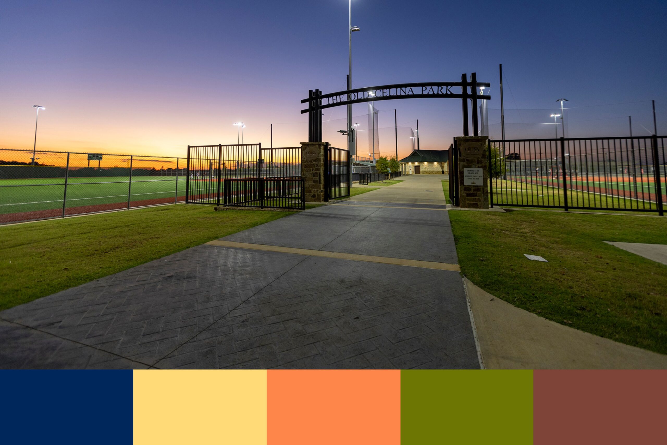
An authentic community brand color palette begins with a deep sense of place. A coastal town might derive its identity from ocean blues and soft light, whereas an industrial center may draw inspiration from exposed brick, steel, or local public art. Rather than selecting literal hues, the goal is to curate a combination that feels genuine to the community while standing out and being distinctive.
Color plays a crucial practical role as well. A community’s visual brand appears across diverse touchpoints, from street banners and park signage to digital platforms and official notices. It is vital to have a palette that provides enough breadth and contrast to ensure accessibility across applications. A well-designed palette creates a cohesive identity across all applications, using primary, secondary, and high-contrast accent colors to maintain legibility and visual harmony.
Ultimately, a community’s colors are far more than a cosmetic choice, they are the visual heartbeat of the place. When a palette successfully bridges the gap between psychological emotion, local authenticity and practical civic design, it transcends aesthetics. It creates a shared visual language that instills pride in its residents and tells the world exactly who a community is.