
Quincy & Adams County, Illinois
For those who understand that action is character, Quincy/Adams County, Illinois, on the banks of the Mississippi River is distinguished by a history of caring and an unwavering commitment to going the extra mile, so you are welcomed, supported and motivated in all that you do.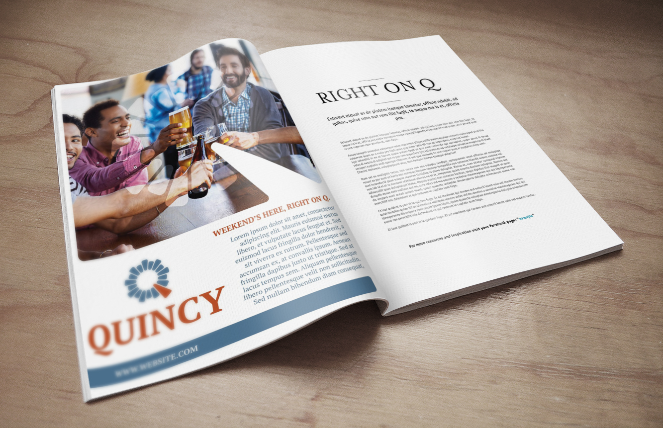



Category
Community WideAbout This Project
Quincy is one of the shining stars in Illinois. Historic, beautiful and growing in a time when many cities of similar size in the state are struggling. But part of being great is knowing you can be even better. City leaders recognized that various public sector organizations in Quincy weren’t working as a team, in large part because they all had different ideas about what made the city special. The first step in getting everyone on the same page was a branding initiative to identify exactly what page that is.
Take a trip to Quincy and you’ll be surprised by the number of visiting Mormons. Talk to those visitors and you’ll be touched by the tears that well up as they pay tribute to Quincy, describing how the community protected their forefathers fleeing religious persecution and death in the 1800’s. For them Quincy is not a vacation, it’s a pilgrimage of gratitude. And that is just one example of Quincy’s almost 200-year history of caring – and acting on that compassion – in a way that saves lives, changes lives and lifts lives. Quincy is rich with resources and assets, but going the extra mile is what makes the city magnificent.
Creativity
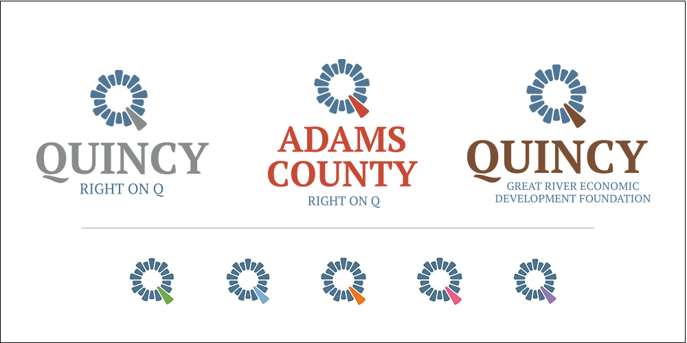
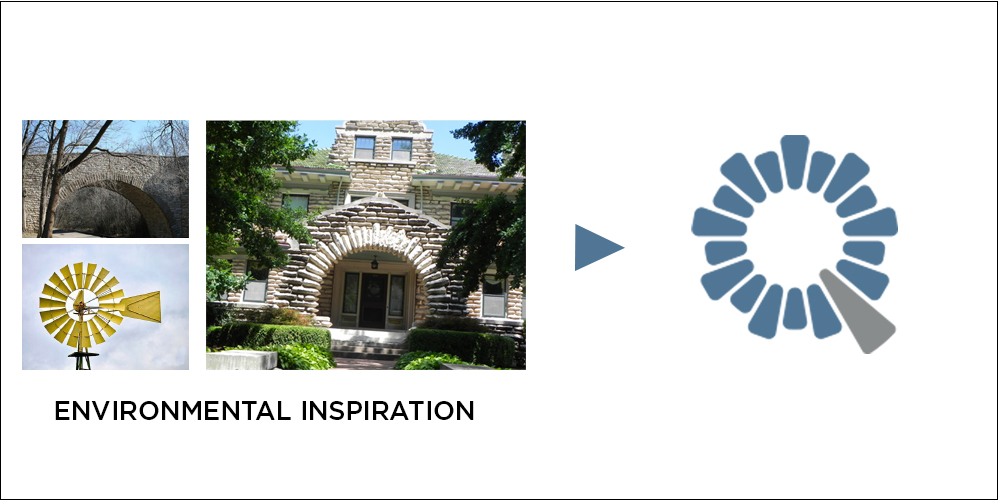
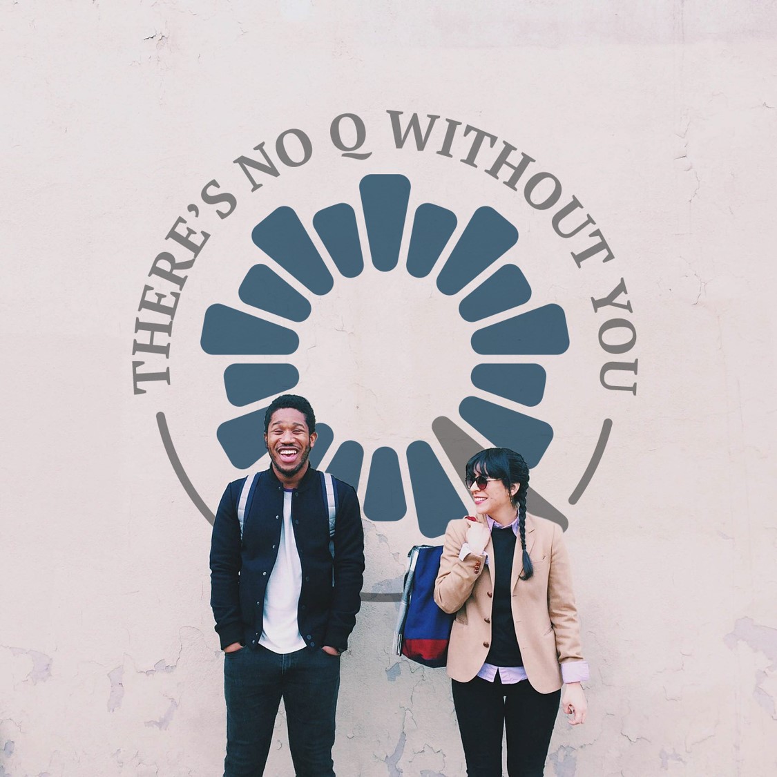
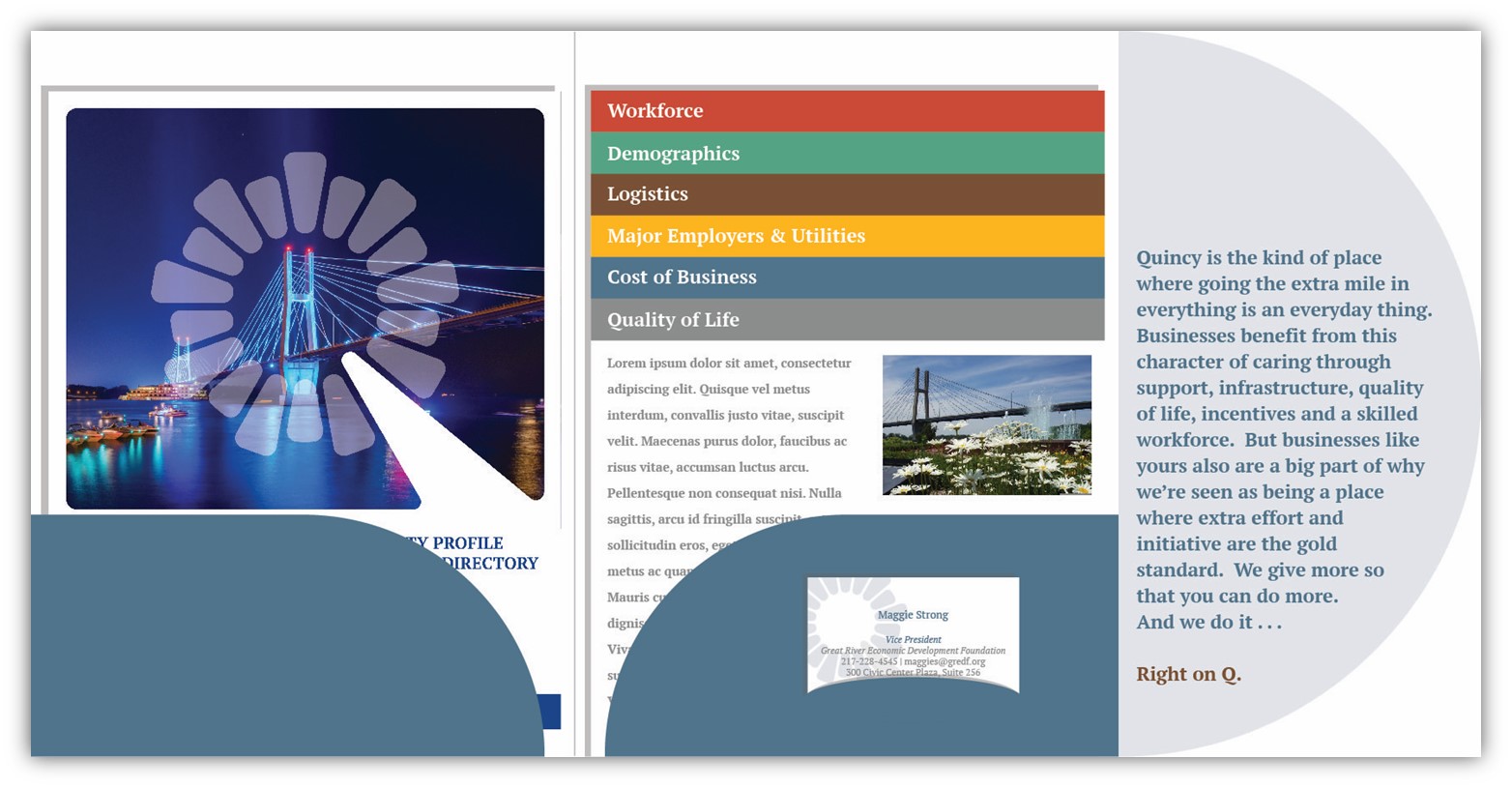
Quincy’s graphic identity leverages the unique letter that leads the city’s name. The line, “Right on Q” conveys that Quincy is the right choice. When people or businesses or organizations need help or support of any kind, Quincy is there…Right on Q. The logo brings the Q to life in a monogram that uses the city’s historic architecture as inspiration. It is an abstract representation of various historic elements from windows to doors to bridges. Stones circle the Q, while the keystone serves as the leg. The look that extends the graphic identity into the community uses a watermark of the logo to contain the subjects of photography. The leg of the Q is used as a spotlight for emphasis and the headline structure is easy to use and reinforces the strapline.
