Georgetown, Texas
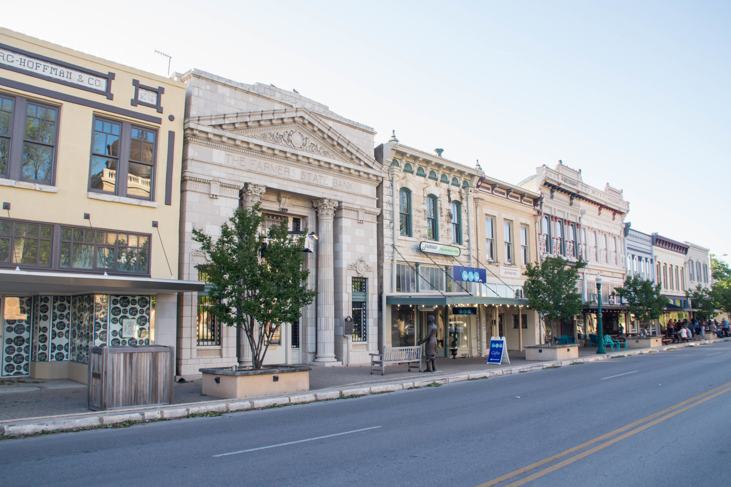
For those who prefer the ease of Austin adjacent, Georgetown, with the most beautiful town square in the state, is the genuine, comfortable Central Texas you hoped for, where your growth (personal and professional) is met with a strong sense of belonging.

Category
Community WideAbout This Project
Key Challenge
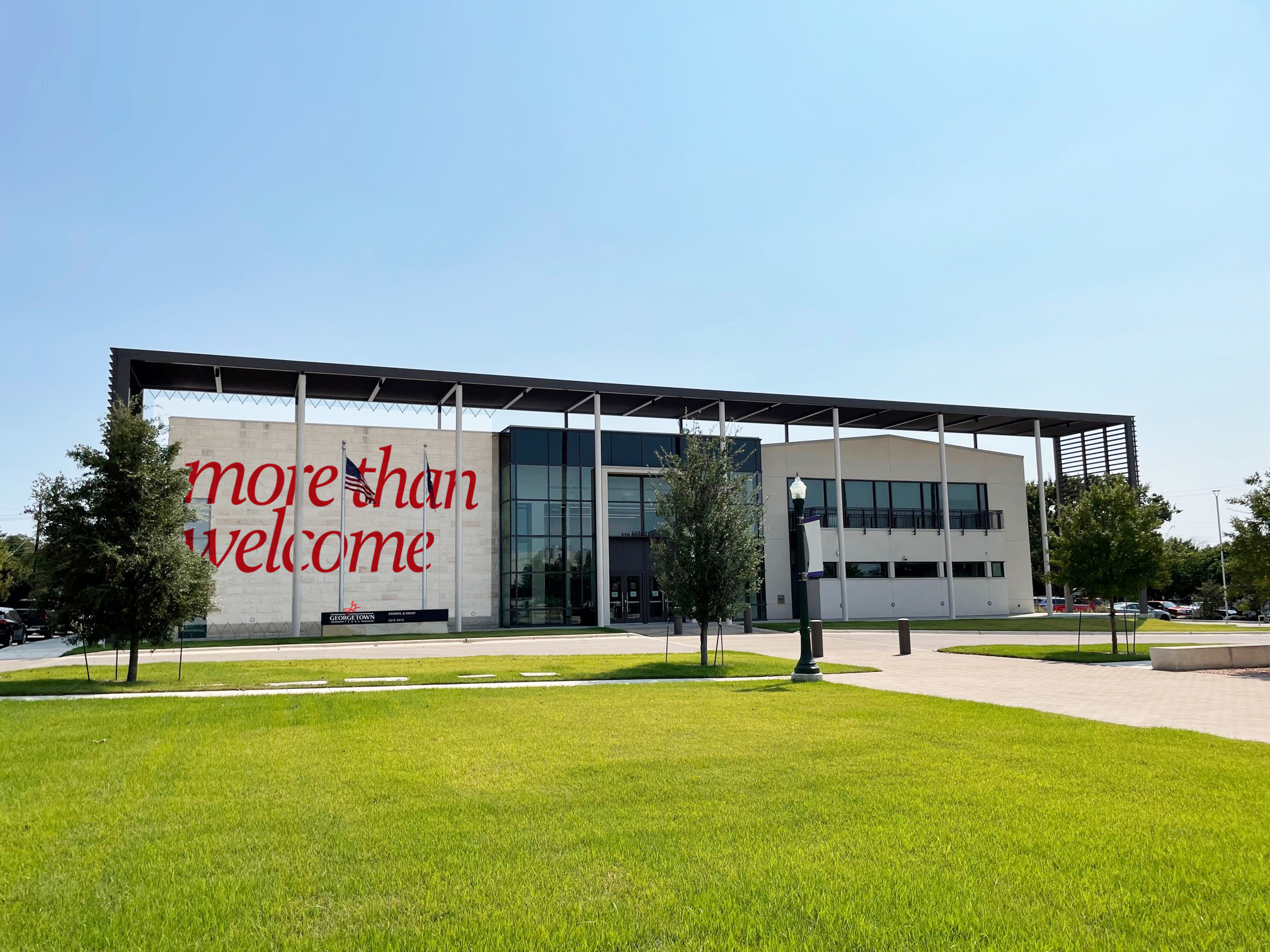
Georgetown struggled with a lack of identity. Its 15-year-old logo was hard to use but had been applied to buildings and other installations with a permanence that was difficult to walk away from—the mark was everywhere. It’s ironic that it had not become iconic. The City had good intentions in creating guidelines for the brand, but they were too strict for some departments. Those groups often went rogue and created their own elements, not even asking for forgiveness later. Thus, the City lacked a clearly defined tone and feel in its communications, and it set out to understand the authentic identity of the community with a secret hope that an updated mark could reflect and introduce that distinction.
Critical Insight
Texas elicits certain expectations, as does the Texas Hill Country. Few communities can deliver on that quintessential character while still offering ease and opportunity, but Georgetown is that Central Texas community you are drawn to. Historic yet current; convenient yet distinct; down-to-earth and forward thinking; far enough from urban complexity but close enough for urban experiences on your terms. Georgetown is celebrated for its historic and lively Downtown Square destination. The region is synonymous with growth, opportunity, and active lifestyles. Georgetown delivers those in a more comfortable, manageable setting than others. A strong sense of community attracts many to Georgetown, from lifetime residents to newcomers.
Brand Identity
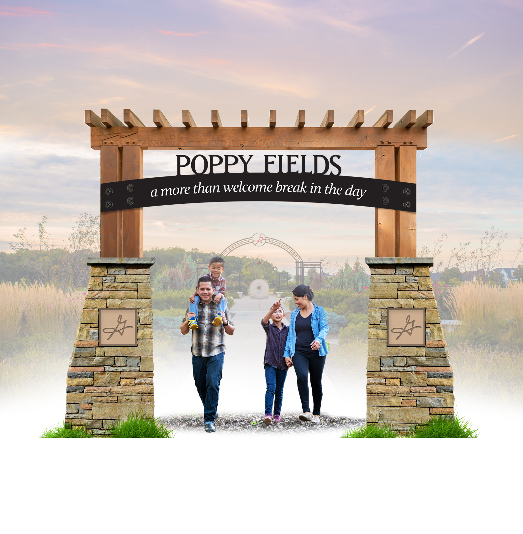
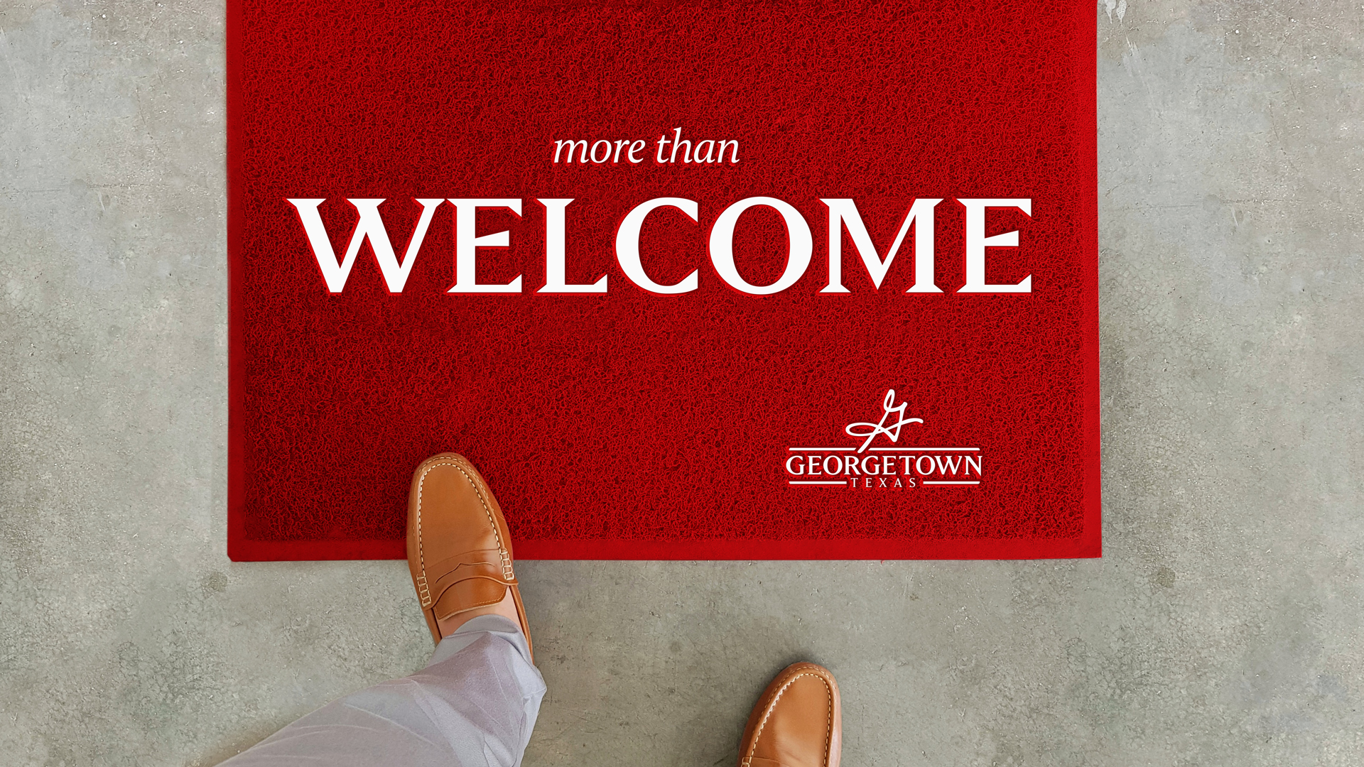
Research revealed that Georgetown is welcoming to people and ideas and then some. Its More than Welcome brand uses a common phrase that is comfortable, relaxed, and easy to relate to, delivering the strong sense of belonging and opportunity available to everyone in Georgetown. It is a great showcase for Georgetown’s many superlatives, and it serves as an invitation for businesses and visitors. Luckily, the existing mark was emblematic of the distinction uncovered during the research. It just needed some vibrancy from a broader palette and a haircut that made it easier to use. The update is a more modern and refined version of their classic ‘G,’ which is now integrated with the word mark. Serif typefaces lend a sense of stability and history, and the unique letter forms present the community’s friendliness. The lowercase strapline continues that comfortable welcome and provides a cohesive lockup. The creative exercise included surprises along the way. While the research informed us that the classic ‘G’ was seen as a trusted source of information, the design exercise revealed a cowboy hat that had somehow remained hidden in the swoops of the capital letter. Perfect for the quintessential Texas town.
The More than Welcome brand has become a point of pride for the community and delivered the consistency and cohesiveness the City prioritized. It won Savvy’s, which are national awards for the best community branding and communications from 3CMA.

